| Image |
Comment |
| 05/03/2007 08:10:04 AM |
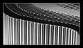
Rythmby buzzrockComment by noraneko: My initial reaction is very positive - partly because the thumbnail stood out enough that I wanted to open it, and partly because b&w photos with a lot of contrast are inherently engaging if done well. Obviously the lines are a strong point here. The photo invites me to search for patterns, and the top right reminds me of piano keys. What feels "wrong" to me: photo seems slightly askew, like maybe it should be rotated to the right a tad or have a slightly different crop. This perception might also be corrected if the area on the far left weren't distractingly bright.
Overall - great gut reaction - thumbs up. Would have voted this a 7 or 8 in a contest. |
 Photographer found comment helpful. Photographer found comment helpful. |
| 05/02/2007 10:01:55 PM |
Rythmby buzzrockComment by slickchik: Love the symmetry and sense of motion. I would not have realized what they were if you had not mentioned it in the description. |
| Photographer found comment helpful. |
| 02/21/2007 09:37:27 PM |
|
| 02/11/2007 11:46:20 PM |
|
| 11/18/2006 11:08:10 PM |
|
| Photographer found comment helpful. |
| 11/18/2006 10:27:52 PM |
|
| Photographer found comment helpful. |
| 10/19/2006 09:55:27 PM |
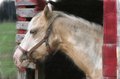
Horse_Paint.jpgby buzzrockComment by ecdillon: The paint effect looks perfect here. Nice idea. It also works really well with the vibrant red and greens in the background. |
| Photographer found comment helpful. |
| 10/15/2006 12:49:11 AM |
Rythmby buzzrockComment by violinist123: This is great. Excellent subject choice for BW treatment with a nice mix of tones. The curve and tones combine to produce a gradient effect which is pleasing to the eye. Also the curve obviously juxtaposes against the abundance of straight lines in the image (not sure what other commentor was getting at there) which is a nice twist (no pun intended). Only thing that detracts from this shot (besides it being an abstract which is pretty much instant death on this site) is that the cases aren't standing perfectly vertically. some are slightly tilted and it detracts from the inherent geometric beauty in the image. Really cool, nice work. |
| Photographer found comment helpful. |
| 10/15/2006 12:07:33 AM |
Rythmby buzzrockComment by posthumous: You are using the classic S curve, which I discuss on this picture:

You have the disadvantage of not having your curve in any sort of context, nothing for it to play against. I like the complexities of the different things along the edges of the cd cases, but ultimately they are all in the same S curve. Slight variations also add some interest, but to be honest it's not very long before I'm done looking at it. |
| Photographer found comment helpful. |
| 10/13/2006 12:45:42 AM |
|
Home -
Challenges -
Community -
League -
Photos -
Cameras -
Lenses -
Learn -
Help -
Terms of Use -
Privacy -
Top ^
DPChallenge, and website content and design, Copyright © 2001-2025 Challenging Technologies, LLC.
All digital photo copyrights belong to the photographers and may not be used without permission.
Current Server Time: 04/07/2025 12:17:06 AM EDT.