| Image |
Comment |
| 05/13/2006 10:00:58 PM |
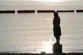
Stand On Your Own Two Feetby OriontjComment by yanko: Comment:
Greetings from the Critique Club...
Hi Todd. I really like your shot and the idea behind it. As a challenge entry it works the theme really well, IMO.
As mentioned during the challenge that dark barrier at the top really takes away from this image. Might I suggest taking a different angle perhaps further to the right or left of your subject, just enough to allow you to crop off that barrier. Or maybe have this person swim out to the barrier and stand on it instead? :P
Seriously, the barrier is the main thing but you probably already new that. The other thing is the image is on the small side. Taking advantage of the 640 width limit is really to your advantage especially in shots like this. It just gives a better impression about the quality when it's larger.
|
 Photographer found comment helpful. Photographer found comment helpful. |
| 05/07/2006 04:52:17 AM |
|
| Photographer found comment helpful. |
| 05/07/2006 03:24:22 AM |
|
| Photographer found comment helpful. |
| 05/05/2006 12:37:56 AM |
|
| Photographer found comment helpful. |
| 05/03/2006 12:54:01 PM |
Stand On Your Own Two Feetby OriontjComment by lambie83: I really like this. The only problem is the black object in the background that are bumping into the person's head. I like the colors and the feel though. |
| Photographer found comment helpful. |
| 05/03/2006 01:37:55 AM |
Stand On Your Own Two Feetby OriontjComment by jent: a larger photo would be nice. Also rasing the camera slightly so the background blocks was not merging with the subject would improve the scene. |
| Photographer found comment helpful. |
| 04/16/2006 03:06:35 PM |
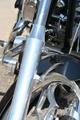
Untitledby OriontjComment by sabphoto: Fits challenge=5
Color/lighting=0
DOF/focus=1
Wow factor/uniqueness=0
Attractiveness=0
I think you could have done a couple simple things to avoid this looking like a traditional snap shot... Get rid of some of your brightness, if you can't move the bike to another location then maybe find a way to shield it, your chrome is blown out to the point of being a distraction. I think the rim itself would have been more interesting shot at the right angle.
Your colors are a little plain and dull, see if you can adjust the curves a little or maybe your brightness and contrast to make this image stand out more.
While your image isn't really too small, it is well below the recommended submission sizes so you had room to grow. Try and use the full size allowed
to maybe give more to look at or at least a larger image to appreciate.
Hope this helps. |
| Photographer found comment helpful. |
| 04/16/2006 11:18:27 AM |
|
| 04/12/2006 02:53:26 PM |
Untitledby OriontjComment by GrayGhost: Nice bike. The fork is just too dominant, wish your composition focussed more on the spectacular front wheel with the more interesting curves. |
| Photographer found comment helpful. |
Home -
Challenges -
Community -
League -
Photos -
Cameras -
Lenses -
Learn -
Help -
Terms of Use -
Privacy -
Top ^
DPChallenge, and website content and design, Copyright © 2001-2025 Challenging Technologies, LLC.
All digital photo copyrights belong to the photographers and may not be used without permission.
Current Server Time: 03/12/2025 06:58:21 PM EDT.