| Image |
Comment |
| 09/12/2006 11:00:11 PM |
|
 Photographer found comment helpful. Photographer found comment helpful. |
| 09/10/2006 11:12:30 PM |
|
| Photographer found comment helpful. |
| 09/09/2006 09:56:10 AM |
|
| Photographer found comment helpful. |
| 09/07/2006 04:56:56 PM |
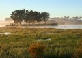
Island In The Mistby Tap10Comment by ganne: Too much of unwanted stuff in front doesn't make it 'Rule of Thirds'..sorry. You should have tried it in different angles and different styles. |
| 09/06/2006 06:17:16 PM |
|
| Photographer found comment helpful. |
| 09/06/2006 04:43:36 PM |
|
| Photographer found comment helpful. |
| 09/06/2006 01:54:21 PM |
|
| Photographer found comment helpful. |
| 09/06/2006 09:20:54 AM |
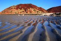
Low Tideby Tap10Comment by CNovack: The composition to highlight and make the shapes of the lines in the low tide the main subject makes the shot interesting. But while the concept is good the composition needs improvement. The colors on the mountain in the background appear a bit too oversaturated which tells me that this was done to get a punch of color. It does add color but it does not appear natural to my eyes. Generally it is early morning and very late afternoon hours that will give the photographer some wonderfully rich and deep tones - not to mention the potential for a colorful sky if there are clouds at that time. I believe, given the title, that the main focus was the shapes/lines of the low tide. But you have introduced another element that I think is rather distracting and detracts from the image -that is the mountain in the background. Perhaps a change in angle and tighter focus would have made a rather unique composition that moves from average snapshot into a above average shot. I.E. shoot the picture with the camera looking down at a 45 degree angle and tight crop showing the lines with just the reflection of the sky and the mountain to add visual interest & color. |
| Photographer found comment helpful. |
| 09/05/2006 09:08:51 PM |
Low Tideby Tap10Comment by rickyprego: Looks nice. I think it would be better if you captured a little less of the sand and a little more of the sky. After all, it is a nice blue and compliments the red mountains. |
| Photographer found comment helpful. |
| 09/04/2006 09:23:32 PM |
Low Tideby Tap10Comment by angela_packard: Technical: the contrast, coloring, the composition...they are all right on!
Creativity: very creative, i don't think i have ever seen this type of image!
Personal Opinion: i like it...i am not really sure why...just do!
Score: 10 |
| Photographer found comment helpful. |
Home -
Challenges -
Community -
League -
Photos -
Cameras -
Lenses -
Learn -
Help -
Terms of Use -
Privacy -
Top ^
DPChallenge, and website content and design, Copyright © 2001-2025 Challenging Technologies, LLC.
All digital photo copyrights belong to the photographers and may not be used without permission.
Current Server Time: 04/21/2025 06:29:27 AM EDT.