| Image |
Comment |
| 02/03/2003 04:41:30 AM |
Busy Beeby HoogieComment by aussie: Excellent capture. The clarity is brilliant as well as the dof. I really like the warm colours. The bee adds a lot of interest. I also like how you have the focus slighly off centre and it's not smack bang in the centre of the image. I really hope this one places. So for such a great effort here's a 10 for you. This image deserves recognition. Well done and GL. |
 Photographer found comment helpful. Photographer found comment helpful. |
| 02/03/2003 12:34:54 AM |
|
| Photographer found comment helpful. |
| 02/01/2003 10:02:46 PM |
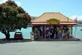
WEIGHBRIDGE........old roadsign in akaroa NZby HoogieComment by ambaker: Critique Club Review
There is a lot going on in this photo, perhaps a bit too much. Overall I like this picture. However, as related to the challenge, the sign is overshadowed by the rest of the picture. I like the shop, and the car under the tree. It looks like something you would have seen here in California in the 60's. A bit too much parking lot in the foreground I think. Also focus seems a bit soft looking at the people in the shop. It looks like you were fighting a very bright day here, as the roof is almost bleached white to get any kind of light into the shadows in the shop. Judging from the shadows, this was a "high noon" shot, which are the worst for getting detal as the direct overhead sun wants to render things flat. Perhaps another shot later in the day would give better results. |
| 01/25/2003 11:47:39 AM |
|
| 01/23/2003 10:54:07 PM |
|
| 01/23/2003 10:33:53 PM |
|
| 01/23/2003 10:16:03 PM |
WEIGHBRIDGE........old roadsign in akaroa NZby HoogieComment by Lustre: As a roadsign it doesn't interest me, however I find the mini parked under the tree kind of cute - with some creative editing that could become a cool photo. Technically though your photo is ok - composition is good, the image is perhaps a little overexposed or too bright though. |
| 01/22/2003 11:19:35 PM |
|
| 01/22/2003 01:51:37 PM |
WEIGHBRIDGE........old roadsign in akaroa NZby HoogieComment by joshua: don't like this...the inside is too dark (nothing you can do about that) shack isn't level, otherwise it's ok, the sharpness and brightness are right on. this just looks too much like a snap shot, kind of thrown together haphazardly |
| 01/22/2003 10:30:33 AM |
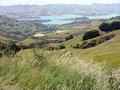
Outside local pub.....Akaroa....New Zealandby HoogieComment by crabappl3: Critique Club Comment:
I will try not to rehash all of the comments left already so lets look at color. This photo has some great colors in it and I feel that with some minor curves/levels/contrast adjustments you could make this really pop off of the page. With all of the shades of green in the foreground in contrast with the blue of the water, you could make the viewer really want be sitting on the hill looking at the lake.
I like the composition of this shot. A little more sky and a little less of the tall grass may make it more relaxing to me.
You technical skill are good, there is not signs of artifacts and the picture is nice and crisp.
You have captured a very nice view that has me longing to see more.
Here's a quick and dirty mock up of what I was talking about. It's a little to much, but you get the idea: //www.pbase.com/image/11318466
-danny Message edited by author 2003-01-22 11:46:50. |
| Photographer found comment helpful. |
Home -
Challenges -
Community -
League -
Photos -
Cameras -
Lenses -
Learn -
Help -
Terms of Use -
Privacy -
Top ^
DPChallenge, and website content and design, Copyright © 2001-2025 Challenging Technologies, LLC.
All digital photo copyrights belong to the photographers and may not be used without permission.
Current Server Time: 04/18/2025 08:13:58 PM EDT.