There Are Dead Among Usby
breadfan35Comment by Pedro: Overall it's a very nice image. one that would look very nice when presented well (in a frame on a wall i mean). from a DP perspective (or any other type of online contest for that matter) I can offer a few opinions.
First off, conceptually it's a solid idea. it really could have gone into shallow DOF or minimalism quite nicely as well. in fact as a shallow DOF entry you'd likely get more attention, since the field is so huge and diverse in this one.
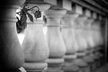
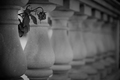
With regards to the composition, there are a few minor adjustments that would make it flow better i think. To stick with the 'rules' of photography, I'd like to see the rose a little lower and a bit to the right. The real subject is the flower, so using the rule of thirds makes sense to me. It sits so high in the frame it's out of the viewers natural gaze and almost acts as a distraction rather than a focal point (in theory we naturally look at the intersections of the 1/3 lines in a photo - in case you haven't seen it, draw a tic-tac-toe board over the picture; where the lines intersect is where you put the intended focal point of the photo).
You've created some great leading lines in this photo, which end rather abruptly at the left. it's kind of hard to tell, but i think if you backed the crop out a little and made it taller (same width) it would continue with a bit more flow with the inclusion of the square part at the top of the leftmost column. (coincidentally that would put the rose on the third-line as well)
the technicals of the shot are pretty good, though the focus almost seems to be a bit short - as if it's on the first column and not the rose (though that could easily be a result of the reduction in size for submitting it). Where an image like this will fail to grab the attention of the voters (hence the lack of comments, and the score of 5.3 - just a guess) is in it's subtlety. The prevailing theory is that you have 5 seconds to impress the voters enough to move them to look deeper or give it a high score off the bat. Low contrast images like this one need to have a really compelling subject or they'll get passed over without further inspection. one objective way to check your contrast is to look at the histogram (in photoshop under the window menu check 'histogram'). Your image has a histogram that shows most of the tones in the mid-range - no whites at all, and very little true black. Try using curves or levels to increase the contrast so that the histogram stretches out a little and presents the full range of tones from black to white (check your e-mail in a few minutes). the contrast will keep their attention a little longer and give them time to absorb the rest of the shot.
all in all i quite like this and with a few minor changes you have a better shot at getting the masses to like it too.
good luck with it - I like where you're going with it.
P