Fishingby
meendeeComment by KaDi: Greetings from the Critique Club!
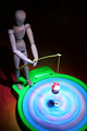
What a fun image you have here! Don't ask my why it didn't score better...I can only imagine unfamiliarity with the game (as in my case) or eyes rolling at another "woody" or that there were so many more images with something the voters liked better. But I suppose this
does need to be addressed first in terms of the challenge because it probably wouldn't be done if it weren't for that topic. So, it fits the challenge. It interprets the challenge well. (Even if you don't know the game....I thought it was a spin-art kit.)
Technically this is well lit. I like the composition and framing. The overall colors are pleasing...though the tabletop might have been more harmonious in a more "festive" color to complement the game. The whites on the bobble are a bit bright and lacking in detail and richness of color...admittedly hard to control with your lighting method. What should be sharp is. What shouldn't be isn't.
If I were trying to improve this image, I'd tip woody's head a bit more down and crop that tiny triangle out of the lower right corner. With a different editing rule-set than Basic, I'd try to improve the contrast on the bobble and I'd clone some of the highlight on the green part of the game to soften it and possibly do something to lessen the obviousness of the joint on woody's shoulder. But there's not much here to improve, in my opinion. It seems you found a way to answer the challenge topic. What would this be outside of the challenge?
Keep shooting! Keep creating! There's a lovely sense of humor at work in you!
--Kadi