| Image |
Comment |
| 04/13/2003 11:23:24 PM |
|
| 04/13/2003 10:37:27 AM |
|
| 04/13/2003 03:24:44 AM |
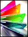
shadeby quicksand84Comment by chickadee: A little too bright, and the Top/Bottom ballance is out..... Cool concept. Good use of colours. |
| 04/12/2003 10:50:03 PM |
shadeby quicksand84Comment by BJ: I think the concept on this was very good, however I feel the harsh lighting draws attention away from the colors. |
| 04/12/2003 12:21:45 PM |
|
| 04/11/2003 01:49:05 PM |
|
| 04/10/2003 12:03:36 AM |
shadeby quicksand84Comment by dacrazyrn: Nice idea. Lighting is good. Not too sure on the DOF, I like the way the front part of the cases are blurry, but can't find a decent place to focus my attention. There is a bit of noise or specks, especially on the green |
| 04/09/2003 02:29:42 PM |
shadeby quicksand84Comment by Amiee: Nice clear and focused image. Good job with the colors. I really like the layout you planned for the image as well. |
| 04/09/2003 10:37:02 AM |
shadeby quicksand84Comment by kiwiness: Nice vivid colors here, the graininess also works well. Is that vignetting in the top corners? |
| 04/09/2003 05:06:10 AM |
|
Home -
Challenges -
Community -
League -
Photos -
Cameras -
Lenses -
Learn -
Help -
Terms of Use -
Privacy -
Top ^
DPChallenge, and website content and design, Copyright © 2001-2025 Challenging Technologies, LLC.
All digital photo copyrights belong to the photographers and may not be used without permission.
Current Server Time: 03/12/2025 03:21:31 PM EDT.