| Image |
Comment |
| 09/11/2008 08:17:41 PM |
|
 Photographer found comment helpful. Photographer found comment helpful. |
| 09/11/2008 02:05:49 PM |
|
| Photographer found comment helpful. |
| 09/11/2008 02:56:14 AM |
Too Lateby Dmosier21Comment by rinac: Hehe, not a very good advertisement for an energy drink, is it? Like the dof, just wish his fingers weren't cut off. |
| Photographer found comment helpful. |
| 09/10/2008 11:06:58 PM |
Too Lateby Dmosier21Comment by onedragonchick: hahahaha I know this sene!!! I like the idea but nothing really seems in focus accept his middle finger. Also the lighting could be better but I understand why it is the way it is. |
| Photographer found comment helpful. |
| 09/10/2008 12:42:43 PM |
|
| Photographer found comment helpful. |
| 09/10/2008 12:26:03 PM |
|
| Photographer found comment helpful. |
| 09/03/2008 02:42:21 PM |
His Roadby Dmosier21Comment by JuliBoc: This would be very good for this week's challenge: Shallow DOF. You have the skill and the tools, you should do well. |
| Photographer found comment helpful. |
| 09/03/2008 09:15:45 AM |
His Roadby Dmosier21Comment by glad2badad: Duplicating my thoughts/comments here that were made in this thread ==> Methaphorical Road - DNMC? Shoehorned & Obvious?
Well, I gave it a 10. The image made me stop and think. That by itself is enough to say an image worked. Additionally, I considered a couple of other things in scoring this:
1) It takes fortitude to praise God publicly, and in the context of this challenge theme I think it was a great opportunity to do so.
2) I also figured the photographer was probably getting hammered on this so I tossed him a 10 to help lift him up.
On a technical point, one commenter mentioned the crop & aspect ratio of this. I have to agree that adding a movie frame type border (top & bottom) would have made the presentation stronger. |
| Photographer found comment helpful. |
| 09/03/2008 08:55:59 AM |
His Roadby Dmosier21Comment by h2: That's a road definitely overly travelled - didn't meet challenge. technically, violinist is quite correct; dull lighting, bad crop. lacks of "punch".
For your next entry avoid unusual aspect ratios, if you can't crop better, add an irregular border (movie style black bars had enhanced this image much compositionwise). Go for more contrast. |
| Photographer found comment helpful. |
| 09/03/2008 12:57:59 AM |
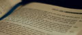
His Roadby Dmosier21Comment by Yo_Spiff: Wow, your metaphor came in even under mine! We are both misunderstood artistes. This didn't come up for me in voting, though I did look at it when browsing the images right after the starting rollover. I definitely got the metaphor, but then my own was also misunderstood. (Perhaps it was that my sign implied the existence of a road that it came in a touch higher?)
As far as the image itself, I think it's decent, and the shallow DOF guides one's eye to the passage on the page. As violinist suggested, religious messages may not always go over well here, and though it's actually a pretty decent shot, it doesn't have any "wow" factor. Message edited by author 2008-09-03 01:02:15. |
| Photographer found comment helpful. |
Home -
Challenges -
Community -
League -
Photos -
Cameras -
Lenses -
Learn -
Help -
Terms of Use -
Privacy -
Top ^
DPChallenge, and website content and design, Copyright © 2001-2025 Challenging Technologies, LLC.
All digital photo copyrights belong to the photographers and may not be used without permission.
Current Server Time: 12/14/2025 12:55:24 AM EST.