| Image |
Comment |
| 02/14/2003 05:26:38 PM |
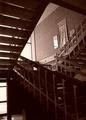
Stairsby DustinComment by sylandrix: Greetings from the Critique Club!
COMPOSITION... I find this area can be improved upon somewhat, depending on what kind of picture you are going for in the end. For an interesting abstract of stairs, I would try getting in closer and looking for a pattern in all those angles. Try a couple of different viewpoints and see what turns out. If you are trying to take a more pulled-back shot, i would choose another angle that obscures any distracting elements in the photo. For instance, the posters on the wall detract my attention from the shapes of the stairs. Actually, I think this is the only major distraction in this shot - Imagining what the photo would look like compositionally without these posters produces pleasing results. Also the photo is slightly tilted - you can use Photoshop's crop tool whenever you see your photo is slightly angled.
TECHNIQUE ... I'd only be repeating what's in the comments already here - I do find there is just too much shadows in the photo. I like the sepia look to the photo - regular color might have made it a bit too run of the mill. Anyway, overexposing the photo a little more would solve the shadow issue, or as Olyuzi suggested, using reflectors or firing your flash could have also solved your problem.
OVERALL.. A very good first attempt. Welcome to DPChallenge!.. hope you enjoy taking part in future challenges!... |
| 02/14/2003 02:32:40 PM |
|
| 02/13/2003 03:37:14 PM |
|
| 02/13/2003 10:14:51 AM |
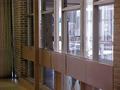
ghostby DustinComment by kiwiness: Well hidden in the reflection and yes it does appear kind of ghostly! The photo seems a little grainy to me, where was your main focal point in this one? |
| 02/12/2003 11:43:40 AM |
ghostby DustinComment by basia03: a little "noisy" on the foreground... i had the same problem with one of my entries, and somebody recommended "neatimage" - free demo software that works wonders! |
| 02/11/2003 04:25:53 PM |
ghostby DustinComment by Swashbuckler: A little grainy, esp. the pole in front of the window and the other stuff that is similarly colored (to a lesser degree). Maybe a different ISO setting? (If available) Waldo fairly well hidden, nice idea. 7 Swash |
| 02/11/2003 03:38:03 PM |
|
| 02/11/2003 01:56:33 PM |
ghostby DustinComment by Amiee: Good image. I really like it!! And I think I know who you are! Haha. Nice job. The reflections add a lot of creativity. |
 Photographer found comment helpful. Photographer found comment helpful. |
| 02/10/2003 03:35:49 PM |
|
| Photographer found comment helpful. |
| 02/10/2003 10:34:03 AM |
Stairsby DustinComment by UberFish: The bright door (bottom left) makes the whole image appear to be twisted, try stepping left to get it out of frame and maybe it'll allow a bit of detail in the dark area to come through. I like the shapes and the contrast in light-top dark-bottom. |
Home -
Challenges -
Community -
League -
Photos -
Cameras -
Lenses -
Learn -
Help -
Terms of Use -
Privacy -
Top ^
DPChallenge, and website content and design, Copyright © 2001-2025 Challenging Technologies, LLC.
All digital photo copyrights belong to the photographers and may not be used without permission.
Current Server Time: 04/21/2025 06:18:40 AM EDT.