| Image |
Comment |
| 11/04/2006 07:40:50 PM |
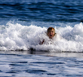
Waveby krakurComment by mamba: good shot, i like how th persons head just seems to appear. though i will say that it wont affect my score, there are some that will score down becaus eof the images size. |
 Photographer found comment helpful. Photographer found comment helpful. |
| 11/03/2006 06:32:00 AM |
Waveby krakurComment by pixeldust: Nice capture, though the photo is a liitle small. You would probably get better scores with a bigger sample. Check out the tutorial at[url=//www.dpchallenge.com/tutorial.php?TUTORIAL_ID=26] |
| Photographer found comment helpful. |
| 11/02/2006 03:43:53 PM |
Waveby krakurComment by karmat: He (she?) looks like he's drowning. Nice blue water, though. The square crop works well, here, I think. |
| Photographer found comment helpful. |
| 11/02/2006 01:28:28 PM |
Waveby krakurComment by jerryc12: Too small. I suspect that the face would be quite blurred if enlarged. |
| Photographer found comment helpful. |
| 11/01/2006 03:40:07 PM |
Diano Castelloby krakurComment by eqsite: This would be much better if you'd used the full 640 pixels in height. As it is, it's a nice composition, but maybe just a tad bit too dark. |
| Photographer found comment helpful. |
| 11/01/2006 11:36:27 AM |
|
| Photographer found comment helpful. |
| 11/01/2006 11:30:54 AM |
Diano Castelloby krakurComment by JustinM: I think of only natural elements in a portrait. If it is a landscape portrait then emphasize only the landscape person portrait = main emphasis on the person |
| Photographer found comment helpful. |
Home -
Challenges -
Community -
League -
Photos -
Cameras -
Lenses -
Learn -
Help -
Terms of Use -
Privacy -
Top ^
DPChallenge, and website content and design, Copyright © 2001-2025 Challenging Technologies, LLC.
All digital photo copyrights belong to the photographers and may not be used without permission.
Current Server Time: 04/27/2025 02:31:10 AM EDT.