| Image |
Comment |
| 01/08/2007 02:51:37 PM |
|
| 01/08/2007 11:20:30 AM |
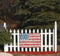
FlagFenceby beetle8Comment by EGoobie: There is too much background. I think it would be better if it were cropped closer to the fence and the flag. |
| 01/08/2007 10:07:03 AM |
FlagFenceby beetle8Comment by manish: The color contrast is great and the fence stands out. However i dont like the blurring of the leaves on the fence as it makes it look a little artificial becuase its on the same place as the fence as logically should be as sharp |
| 01/07/2007 10:26:02 PM |
|
| 01/07/2007 06:51:31 PM |
|
| 01/06/2007 10:12:03 PM |
|
 Photographer found comment helpful. Photographer found comment helpful. |
| 01/06/2007 02:02:35 AM |
FlagFenceby beetle8Comment by klstover: I think maybe a higher file size or less noise reduction or both may have helped this otherwise fantastic image. |
| Photographer found comment helpful. |
| 01/03/2007 04:02:22 PM |
|
| Photographer found comment helpful. |
| 12/05/2006 11:36:46 PM |
aNewLightby beetle8Comment by Dr.Confuser: Greetings from the Critique Club: I have been assigned your photo to critique and here are my thoughts:
Personal Reaction: Looking at your portfolio, I recognize this is your first challenge. Congratulations on your entry and the courage it took to enter. I remember very well my first time was scary.
Composition: Generally, a centered and symmetrical composition can be improved by placing the subject off center. In this case, the green shade is centered but the bulb is off center a bit. The off-centered bulb helps the composition. You might have a look at this thread for more information: //www.dpchallenge.com/forum.php?action=read&FORUM_THREAD_ID=168935&highlight=composition%20rule%20of%20thirds
Technicals: The focus is fine. The bulb a bit over exposed. I like the way the background disappears. I like the grainy texture but many DPC voters do not.
Conclusions: In the final analysis, the subject doesn├óĆÖt seem that relevant to the challenge theme. I agree you have shown your subject ├óĆ£from a certain perspective.├óĆØ But more closely relating the photo to the challenge theme will raise your scores.
As always, this is my personal opinion. Feel free to PM me if you├óĆÖd like further dialog.
|
| Photographer found comment helpful. |
| 11/24/2006 09:27:44 PM |
aNewLightby beetle8Comment by svstoltz: I think you missed the point of the challenge, that is to use perpective, a sense of depth, distance and the relationship of objects near and far, to create a sense of drama. This photo is more of a two-dimensional abstract. |
| Photographer found comment helpful. |
Home -
Challenges -
Community -
League -
Photos -
Cameras -
Lenses -
Learn -
Help -
Terms of Use -
Privacy -
Top ^
DPChallenge, and website content and design, Copyright © 2001-2025 Challenging Technologies, LLC.
All digital photo copyrights belong to the photographers and may not be used without permission.
Current Server Time: 04/26/2025 02:20:47 PM EDT.