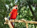
1) Redby
WriteHeartComment by karmat: I hope you don't mind, but I played with this some, because you have a lot of potential in this shot. The red bird against the green background, with the yellowish perch makes for a very pleasant and striking color arrangement.
I use PaintShopPro, so first I hit it with clarify a couple of times. If you use PS, I *think* highlight/shadow does something very similar. Then, because clarify takes some of the color out, I saturated it some.
Then, I used levels to give it more contrast. Admittedly, this made it lose a bit of the detail, especially in the feathers, but it also made the ever so slightly appearance of being out of focus not so noticeable. Also, I really like high contrast pictures and this definitely shows my biased, but less levels adjustments would back it of some.
Finally, I cropped it to get the bird out of the middle and more to the left of the frame and balanced with the perch going out of the right hand side.
Here are a couple of takes -- I will remove it from my portfolio if you want me to.
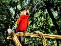
A less contrasty version --