| Image |
Comment |
| 05/22/2007 06:50:07 PM |
|
 Photographer found comment helpful. Photographer found comment helpful. |
| 05/22/2007 05:47:24 PM |
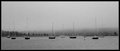
Day 22 - The Coveby CapeSailComment by jonfrommk: Yep its grainy but for me that just enhances the fogginess of the shot
Not sure what dimensions this is (pano?) but it works really well, especially with the border |
| Photographer found comment helpful. |
| 05/22/2007 03:58:52 PM |
|
| Photographer found comment helpful. |
| 05/22/2007 03:05:46 PM |
Day 22 - The Coveby CapeSailComment by Wink: Despite your crazy work week, you've captured a wonderful feeling of calm and stillness on a misty harbor. |
| Photographer found comment helpful. |
| 05/22/2007 03:00:13 PM |
Day 22 - The Coveby CapeSailComment by trevytrev: I like the grain as well and it adds to the photo. The photo looks like something you would find in your grandparents vacation photos. A old throwback look, well done! |
| Photographer found comment helpful. |
| 05/22/2007 11:25:42 AM |
|
| Photographer found comment helpful. |
| 05/21/2007 07:34:17 PM |
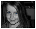
Day 21 - Blue Eyesby CapeSailComment by alexjack: I agree with the comments, the relatively harsh lighting from the on-camera flash tends to cause the deep shadows under her chin which are not too flattering, perhaps a diffusion dome, or something similar would have helped. ALso, I don't really care for the blue colorization, but that's just personal preference.
Jack |
| Photographer found comment helpful. |
| 05/21/2007 06:02:15 PM |
Day 21 - Blue Eyesby CapeSailComment by jonfrommk: OK first things first, I like this as an image...a lot
Now being uber critical (as per your request) a few things to consider
1. the background on the upper right is a little bit distracting. In my limited experience portraits work best where either the subject is interact with the background, or where the back ground is either sharp enough to add something to the image or bokeh enough not to provide any clues as to what it is
2. With this kind of shot you can play around with the contrast quite a bit to make it pop, there are not many whites or blacks in this shot which means that contrast becomes more important
3. Because this is quite a light image in terms on tones a black border may have helped it stand out more
As I said at the start this is being very critical and please dont think that this is anything than a lovely image of your daughter |
| Photographer found comment helpful. |
| 05/21/2007 05:25:53 PM |
Day 21 - Blue Eyesby CapeSailComment by roz: i sort'v agree with sandy about the composition .. but i feel that the eye's are a little bit to contrasty re colour with the rest of the image .. if i'd wanted the eyes selectively saturated i think i'd'v just made more a suggestion of blue rather than the way it is now ..
i love her expression, and the quirkyness .. she looks adorable .. love those freckles .. i'm thinking that a bit more light/contrast in your shot could work .. i'm also thinking that her hair is getting lost in the background .. it does make her face stand out more tho, so i'm not sure about that ... but i'm not the worlds best photographer and anything i say is just my opinion .. and other ppl might totally love this shot exactly the way it is ..
anywhere other than dpc and ppl would be going omg omg this is excellent!! .. i reckon this'd look great in a frame or on the wall .. it is a lovely portrait .. :) |
| Photographer found comment helpful. |
| 05/21/2007 03:54:01 PM |
|
| Photographer found comment helpful. |
Home -
Challenges -
Community -
League -
Photos -
Cameras -
Lenses -
Learn -
Help -
Terms of Use -
Privacy -
Top ^
DPChallenge, and website content and design, Copyright © 2001-2025 Challenging Technologies, LLC.
All digital photo copyrights belong to the photographers and may not be used without permission.
Current Server Time: 04/22/2025 07:31:00 PM EDT.