| Image |
Comment |
| 05/16/2007 02:31:31 PM |
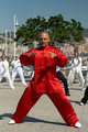
qigong1.jpgby AlmilanComment by doggyd112: very nice shot, i think with some edit on the lighting, you can use this in Selective Desaturation II challenge. Very nice shot. I see people doing Qigong in the States but it is interesting to see Qigong getting popular in Italy also. Great Shot!!! |
 Photographer found comment helpful. Photographer found comment helpful. |
| 05/15/2007 06:13:24 PM |
|
| 05/15/2007 05:47:18 PM |
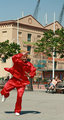
Maestro1.jpgby AlmilanComment by yanko: Yes the woman needs to stay in the shot. If you crop from just the top it would probably work best, IMO. The juxaposition in the size and action of the two people is what makes this interesting. Message edited by author 2007-05-15 17:47:41. |
| Photographer found comment helpful. |
| 05/15/2007 05:46:07 PM |
Maestro1a.jpgby AlmilanComment by yanko: The top part of the building doesn't do anything for me but I like keeping the woman in the shot so maybe just crop from the top and make it more square like. |
| Photographer found comment helpful. |
| 05/15/2007 12:29:48 PM |
Maestro1.jpgby AlmilanComment by posthumous: Originally posted by Almilan:
Cropped too much, maybe?
Edit: Have posted a different version of this  |
I love the lady on the bench! What a great counterpoint! Why don't you just crop off the top of this one? I think that would look great. |
| Photographer found comment helpful. |
| 05/15/2007 12:28:15 PM |
Maestro1.jpgby AlmilanComment by posthumous: I like this. Yes, it's a tight crop but it makes him look like an exciting blotch taking over your photo. His pose is perfect. The OOF background kind of blends into him, though he is clearly demarcated by color. This "blending" keeps the centered composition from being too dull. |
| Photographer found comment helpful. |
| 05/15/2007 11:30:53 AM |
Maestro1.jpgby AlmilanComment by Almilan: Thanks for the comment - actually, there is space on the other side, but there are passers by, which I wanted to try to cut out, hence the first version. I'll have another go. |
| 05/15/2007 11:07:58 AM |
Maestro1.jpgby AlmilanComment by Sheryll: Not sure which one to make the comment on but I agree about Maestro 1 not having enough room to move but I think Maestro 2 is just a little too much room but only because of the lady on the bench behind him. how about somewhere in between. It looks like it may be hard to do but maybe somewhere really close to the lady on the bench and the man just behind the bench? I think this would keep Maestro's shadow in the shot and give him room to move. I'd actually like to see a little more room on the other side too but, I'm guessing there isn't more there to give.
Either way I like the rest of it. The red is very red so a tiny bit of desat might work but be careful not to get it washed out. In fact its fine the way it is here too, its just a matter of taste I suppose. |
| Photographer found comment helpful. |
| 05/15/2007 06:48:15 AM |
Maestro1.jpgby AlmilanComment by Almilan: Cropped too much, maybe?
Edit: Have posted a different version of this Message edited by author 2007-05-15 08:08:50. |
| 05/15/2007 06:46:29 AM |
Maestro1.jpgby AlmilanComment by kashi: Feels squished to me. He's moving, tons of energy, but no room to move.
The red draws my eye, and I like it - bright but not overwhelming. |
| Photographer found comment helpful. |
Home -
Challenges -
Community -
League -
Photos -
Cameras -
Lenses -
Learn -
Help -
Terms of Use -
Privacy -
Top ^
DPChallenge, and website content and design, Copyright © 2001-2025 Challenging Technologies, LLC.
All digital photo copyrights belong to the photographers and may not be used without permission.
Current Server Time: 03/10/2025 02:57:41 PM EDT.