Tears of a Season (opening day - April 6th)by
LonzComment by purpleflutterby13: Greetings from the Critique Club.
Congratulations on your new personal best!
This is a well-executed creative idea. However, I think it has great appeal to a limited number of people who belong to the US baseball culture, and limited appeal to everyone else.
My first reaction was: meh, seen this before with nicer backgrounds. I've never heard of the Cleveland Indians, and had I not read the comments below, I wouldn't even know what sport it was. So while I find the shot technically very well done, I probably would have marked it down on the basis that I don't find it that aesthetically pleasing.
Now, having understood what it's about, my critique would be as follows:
I think the subject matter is very good, and the way in which it has been portrayed is extremely creative. It portrays the passion and emotion that sports fans put into their obsession, and does so in an original way.
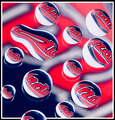
TechnicallyL the photo is sharp and well lit (although the occasional bits are a bit too bright), the composition is interesting, and I think the water droplets going over the edge of the frame work well, as they make the image more 3-dimensional and interesting. I personally don't like the colours, but obviously, given the idea, there wasn't really a choice there.
The reflections of the droplets in the glass are a bit distracting in some of the droplets. I think they work well in the bottom left corner, where it gives a tearlike reflection, but on the top right it just seems a bit distracting. So maybe taking a photo from above rather than from the side might have improved it by getting rid of the reflections? Not sure about that one...
Anyway, that's all I can think of. God, men and sport, honestly... :p
PM me if you have any questions.
Jelena