| Image |
Comment |
| 04/13/2003 04:44:35 PM |
|
| 04/12/2003 08:55:39 PM |
|
| 04/12/2003 11:03:22 AM |
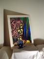
Blueby CoopGirlComment by f-32: Love the painting - wish it were closer.... it'd rate MUCH higher, I think! |
 Photographer found comment helpful. Photographer found comment helpful. |
| 04/11/2003 06:24:04 PM |
Blueby CoopGirlComment by Swashbuckler: It's a nice drawing, interesting and colorful. Blue is a strong color in this pic, but I think yellow or red are more "the subject colors". This is very close to DPC rules on "Other People's Art", no, it's not the only thing in the photo, but the sheets aren't much of "your addition" to this (monitor under one sheet). Focus seems close, but not razor sharp. 5 Rob the Swash |
| Photographer found comment helpful. |
| 04/10/2003 08:59:13 PM |
Blueby CoopGirlComment by sher: i love the art! is this something you did? i think you had a good idea for this photo and it is very colorful. another light source to take care of the shadows on the front of the art would be a good idea and might help with the focusing. i do like the shadow at the back of the art, although i would crop out the bottom part of the photo and use more negative space at the top. |
| Photographer found comment helpful. |
| 04/10/2003 07:46:56 PM |
Blueby CoopGirlComment by frisca: that's a wicked shadow being cast along the bottom of the photo, it completely ruins the effect I think you are trying to achieve. As well, the entire shot is out of focus, and composition would be improved if the shot were straighter and shot from more toward the right. Keep trying though! |
| Photographer found comment helpful. |
| 04/09/2003 11:13:41 PM |
Blueby CoopGirlComment by chickadee: There is too much space around the picture. The door frame is also distracting. |
| 04/09/2003 03:28:33 PM |
Blueby CoopGirlComment by K-Rob: Out of focus and poor lighting but I like the idea. The focal pint is in the shadow. I'm afraid some voters might have missed the idea. I needed a 2nd look to cath it. |
| Photographer found comment helpful. |
| 04/09/2003 11:35:28 AM |
|
| 04/09/2003 09:13:59 AM |
Blueby CoopGirlComment by kiwiness: Lots of color in that poster, the shadows are a little annoying though. If you had maybe moved the lighting differently you might have avoided that shadow covering the bottom half of the image. I like the illusion of the tears as if they are flowing onto the sheet itself. |
| Photographer found comment helpful. |
Home -
Challenges -
Community -
League -
Photos -
Cameras -
Lenses -
Learn -
Help -
Terms of Use -
Privacy -
Top ^
DPChallenge, and website content and design, Copyright © 2001-2025 Challenging Technologies, LLC.
All digital photo copyrights belong to the photographers and may not be used without permission.
Current Server Time: 03/12/2025 09:37:55 AM EDT.