| Image |
Comment |
| 10/01/2008 11:02:07 PM |
good purchaseby cheopeComment by Citadel: DNMC as this isn't really a studio shot. While it doesn't mean that you have to have a studio per se, the shot should at least be indoors with controlled lighting.
Have a look at this to see what is expected:
//www.dpchallenge.com/challenge_results.php?CHALLENGE_ID=480 |
| 10/01/2008 11:35:11 AM |
|
| 10/12/2007 02:55:50 PM |
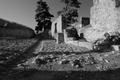
venetian casteby cheopeComment by Veiolets: Hi, this is a really nice image and underrated in the challenge. I might suggest cropping off the bottom shadow but it is nice either way. I voted it a 9 in the challenge. cheers. |
| 10/06/2007 12:27:12 AM |
venetian casteby cheopeComment by Yo_Spiff: A little busy in the details, but nice. Good composition. My eye flows from the right side leftward up the path. |
| 10/05/2007 07:31:04 PM |
venetian casteby cheopeComment by Node: Lovely scene but I think the harsh lighting has removed alot of detail that would have been there otherwise. |
| 10/05/2007 08:23:20 AM |
|
| 10/04/2007 08:03:39 PM |
|
| 10/04/2007 05:10:52 PM |
venetian casteby cheopeComment by Moatz: I would like to see this photo in color, I just dont believe that the b/w version does it justice. I also believe that the shadows and the dirt/branches in the foreground detract from the rest of the image. |
| 10/02/2007 09:15:28 PM |
venetian casteby cheopeComment by Ivory: I think I would have liked to see a little more at the top to see the entire tree and perhaps a little less at the bottem so as not to see so much of that shadow across the bottem. Maybe moving it up a bit would have made it a little more pleasing. I like the use of black and white here though. Good luck. |
| 10/02/2007 07:07:53 PM |
venetian casteby cheopeComment by noraneko: I'm mixed on this one. I like the leading lines a lot. I also like the mood. I'm not sure you quite captured the full tonal range, though, and the right-hand tree is distracting. Still an interesting entry! |
Home -
Challenges -
Community -
League -
Photos -
Cameras -
Lenses -
Learn -
Help -
Terms of Use -
Privacy -
Top ^
DPChallenge, and website content and design, Copyright © 2001-2025 Challenging Technologies, LLC.
All digital photo copyrights belong to the photographers and may not be used without permission.
Current Server Time: 04/27/2025 08:29:03 PM EDT.