| Image |
Comment |
| 07/01/2003 01:39:28 AM |
|
| 06/30/2003 03:45:30 PM |
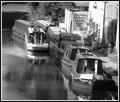
B is for Bargeby tragicharpyComment by robsmith: B is for busy, the boats merge into the image too much, the ones I use to see were bright colours so I'm not sure if B&W as a wise choice. |
| 06/30/2003 10:46:00 AM |
B is for Bargeby tragicharpyComment by BobsterLobster: B is for Blurry Barge! Bit out of focus?! Not quite enough contrast in the tones for my taste. I like the border, very effective. The calm atmosphere has been captured nicely. Not sure about the square crop... what lies to the left? Perhaps could have been improved by including more river at the bottom in portrait mode. 7 |
| 06/01/2003 09:12:33 AM |
|
| 05/31/2003 10:23:49 AM |
Welcome Homeby tragicharpyComment by LarsPaysen: Nice period costumes. It really does look like an old photo (except back in those days, didn't everyone look at the camera because film was expensive? :))
|
| 05/29/2003 08:00:15 AM |
|
| 05/27/2003 04:37:58 PM |
Welcome Homeby tragicharpyComment by alanfreed: Nice -- certainly looks straight out of the past! My only nitpick would be that you probably should have kept their feet within the shot. Otherwise, it looks straight out of an old family album. Well done! |
| 05/27/2003 12:16:01 PM |
|
| 05/27/2003 09:45:38 AM |
Welcome Homeby tragicharpyComment by qachyk: This looks like a very old photo, as it's surely meant to, and a very good setting for it as well. The people in it seem uncomfortable to be photographed (which if they were asked to dress up for this old-style photo I suppose I may understand), which has the drawback of making it look less like the 'welcome' of the title. |
| 05/27/2003 02:11:21 AM |
|
Home -
Challenges -
Community -
League -
Photos -
Cameras -
Lenses -
Learn -
Help -
Terms of Use -
Privacy -
Top ^
DPChallenge, and website content and design, Copyright © 2001-2025 Challenging Technologies, LLC.
All digital photo copyrights belong to the photographers and may not be used without permission.
Current Server Time: 04/27/2025 08:48:43 PM EDT.