| Image |
Comment |
| 04/05/2004 10:43:31 AM |
|
 Photographer found comment helpful. Photographer found comment helpful. |
| 04/05/2004 12:07:48 AM |
Chaotic Reflectionby russiComment by jmsetzler: This is a great photo. I don't like the way you have used the title to wedge it into the challenge though.. I would have given it a 10 otherwise :) |
| Photographer found comment helpful. |
| 03/28/2004 09:03:52 AM |
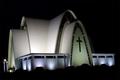
Daily Churchby russiComment by Jovi: A lovely choice of subject but somewhat lacks impact IMO. It would help if you rotated the image a few notches to the right too. Excellent focus and choice of apeture... very well balanced! Best of luck in the challenge! :D |
| Photographer found comment helpful. |
| 03/25/2004 10:54:22 PM |
Daily Churchby russiComment by scalvert: Cool architecture and quite clean for a night shot. You'd score higher with most voters by cropping more off the right and extending the black top & bottom for a vertical format. What's in the foreground? Looks almost like hooded Franciscan monks ;-) |
| Photographer found comment helpful. |
| 03/25/2004 06:03:38 PM |
|
| Photographer found comment helpful. |
| 03/24/2004 08:25:01 PM |
|
| Photographer found comment helpful. |
| 03/24/2004 03:36:29 PM |
Daily Churchby russiComment by brownt: Haven't I seen this shot before... Arnit? Looking back through the challenges I could roughly remember when it was! I liked the shot then, and I like it now.
It does seem to slant down at the left though, the black outlines of cars? are a bit distracting. |
| Photographer found comment helpful. |
| 03/23/2004 11:55:34 AM |
Daily Churchby russiComment by goodygrrl: Great photo. It looks almost like it's CG. Nice touch that everything else is black but the church. |
| Photographer found comment helpful. |
| 03/23/2004 11:50:13 AM |
Daily Churchby russiComment by SharQ: The image is not straight, so it looks as if the church is about to fall off a cliff. |
| Photographer found comment helpful. |
| 03/23/2004 05:13:13 AM |
Daily Churchby russiComment by cbonsall: (I'm writing this to everyone who submitted a landscape shot) The challenge was to produce a shot worthy of a magazine cover but to me a shot like this is not suitable to be put on a "portrait" format magazine.
---ADDITIONAL---
Due to forum discussions and accusations that marking landscapes down is nitpicking, I'm going through them and remarking. I still think some of the landscapes would not make good covers because of their orientation but I am no longer marking down because of that.
I still think landscape is inapropriate for the majority of magazines but I'll give the benefit of the doubt to the photographers. |
| Photographer found comment helpful. |
Home -
Challenges -
Community -
League -
Photos -
Cameras -
Lenses -
Learn -
Help -
Terms of Use -
Privacy -
Top ^
DPChallenge, and website content and design, Copyright © 2001-2025 Challenging Technologies, LLC.
All digital photo copyrights belong to the photographers and may not be used without permission.
Current Server Time: 04/22/2025 05:59:29 PM EDT.