| Image |
Comment |
| 07/25/2004 02:06:09 PM |
|
| 07/24/2004 03:04:00 AM |
Smell The Flowersby Spanish_GreaseComment by BrennanOB: I find it interesting that you only find compliments helpfull, a negative comment no matter how well thought out and reasoned is not helpful: yet " A winner" is helpful. I guess some people only respond to praise. Usually the better photographers have thicker skin, and take a crit as a method of understanding what others saw in their work. Nice job. You have a distinctive style. I will try to refrain from wasting further comments on it. |
| 07/23/2004 11:29:45 PM |
|
| 07/23/2004 07:43:18 PM |
|
| 07/23/2004 06:56:09 PM |
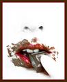
Yumby Spanish_GreaseComment by markmyshots: i'd love to know how you did this..
White makeup? selective desaturation? Two pictures blended together?
I noticed this got DQ'd in Chocolate for the date of pic. im more concerned how you were able to do this with following the basic rules... |
 Photographer found comment helpful. Photographer found comment helpful. |
| 07/22/2004 09:43:31 AM |
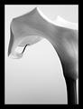
Balanced Graceby Spanish_GreaseComment by Stagolee: Without the title this doesn't represent balance at all. And with the title I still can't see much balance also the frame is a little bold. |
| 07/20/2004 11:33:12 PM |
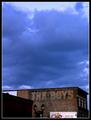
The Boysby Spanish_GreaseComment by L1: This could have more power...possibly crop the white sign out all together; dodge/burn the clouds for definition and emphasis; adjust that shadow on the foreground building; maybe bring out the color in the bricks a tad more. Good foundation; needs tweaking. :o) |
| 07/20/2004 08:04:23 PM |
The Boysby Spanish_GreaseComment by KevinRiggs: I really think you had a great subject and a good eye for it initially. I think this shot would have done better (IMO) as a square. Try cropping it just above the white billboard and then make the height match the width and see how it looks. I think it would make a fairly powerful statement with the deep cerulean sky just above the faded out words. |
| 07/19/2004 10:58:26 PM |
Balanced Graceby Spanish_GreaseComment by C-town driver: Very elegant subject with composition to match. I like the simplicity of this shot and how it implies balance using lines and shapes. One element I found distracting though is the robust border that seem to draw attention away from the main subject. That's only personal taste though, so great shot nonetheless. |
| Photographer found comment helpful. |
| 07/19/2004 04:22:42 PM |
|
| Photographer found comment helpful. |
Home -
Challenges -
Community -
League -
Photos -
Cameras -
Lenses -
Learn -
Help -
Terms of Use -
Privacy -
Top ^
DPChallenge, and website content and design, Copyright © 2001-2025 Challenging Technologies, LLC.
All digital photo copyrights belong to the photographers and may not be used without permission.
Current Server Time: 04/18/2025 10:23:27 AM EDT.