| Image |
Comment |
| 06/02/2003 10:56:52 PM |
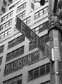
My Cornerby olegComment by eloise: Nice composition, good idea and angle ... but the contrast between foreground (signs) and background (building) is not amazingly apparent, causing Madison to kind of fade away. |
 Photographer found comment helpful. Photographer found comment helpful. |
| 05/31/2003 10:33:18 PM |
|
| Photographer found comment helpful. |
| 05/30/2003 05:07:53 PM |
My Cornerby olegComment by oldwisemonk: A better execution of this type of shot than the other entry I saw. I like the black and white. |
| Photographer found comment helpful. |
| 05/29/2003 01:53:29 PM |
|
| 05/28/2003 02:56:13 PM |
My Cornerby olegComment by carolee: I'd have pumped up the contrast a bit on this to make it stand out more. (Of all the "road sign" photos, I like this one the best) :) |
| Photographer found comment helpful. |
Home -
Challenges -
Community -
League -
Photos -
Cameras -
Lenses -
Learn -
Help -
Terms of Use -
Privacy -
Top ^
DPChallenge, and website content and design, Copyright © 2001-2025 Challenging Technologies, LLC.
All digital photo copyrights belong to the photographers and may not be used without permission.
Current Server Time: 03/13/2025 03:14:19 AM EDT.