| Image |
Comment |
| 06/29/2008 08:27:17 PM |
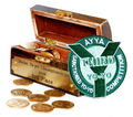
Even 3rd has golden rewardsby SarahJ1337Comment by ambaker: Critique Club Review:
Color Saturation and Hue: Colors are realistic and not over-saturated. Brightness and contrast: Details are held in the shadows, one small area is at burn-out and loses some detail in the coin at the left edge of the box interior. However,the background appears featureless and bright. It winds up competing with the subject by its brightness alone.
The picture does tell a compete story, but the patch competes with the chest, and both attempt to tell the same story.
The image appears to be a bit overprocessed. The edge on the patch is so hard, that it almost appears to have been photoshopped in. |
| 06/20/2008 07:04:08 PM |
|
| 03/11/2008 06:28:16 PM |
Spork?by SarahJ1337Comment by arron_christensen: Great concept. I think that the focus is a little to soft, but it looks like the light balance and dof are right on. |
| 03/10/2008 03:02:55 PM |
|
| 03/09/2008 11:21:21 PM |
Spork?by SarahJ1337Comment by dponlyme: My eye went straight to the glue which is out of focus. The colors are a little washed out. The string doesn't work for me. |
 Photographer found comment helpful. Photographer found comment helpful. |
| 03/09/2008 03:59:56 AM |
|
| 03/07/2008 11:50:09 PM |
|
| 03/05/2008 04:37:24 PM |
|
| 03/05/2008 03:31:28 PM |
|
| 03/05/2008 02:15:42 PM |
|
Home -
Challenges -
Community -
League -
Photos -
Cameras -
Lenses -
Learn -
Help -
Terms of Use -
Privacy -
Top ^
DPChallenge, and website content and design, Copyright © 2001-2025 Challenging Technologies, LLC.
All digital photo copyrights belong to the photographers and may not be used without permission.
Current Server Time: 03/14/2025 09:50:31 AM EDT.