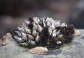
DPChallenge: A Digital Photography Contest You are not logged in. (log in or register
 
Browse Settings
Currently viewing:
Registered Userjnenvir

Show comments:

Per page:

Order:

Comments:


Comments Received by jnenvir
Pages:   ... [109] [110] [111] [112] [113] [114] [115] ... [125]
Showing 1111 - 1120 of ~1249
Image Comment
Determined
03/06/2009 10:51:20 AM
Determined
by jnenvir

Comment by digitalphoto:
I don't like how blurry the photo is.
Determined
03/06/2009 07:35:55 AM
Determined
by jnenvir

Comment by Melethia:
Love the energy, the blur, and yes, the determination.
Photographer found comment helpful.
Determined
03/04/2009 11:11:05 AM
Determined
by jnenvir

Comment by Connor:
great shot
Photographer found comment helpful.
Determined
03/01/2009 09:30:46 PM
Determined
by jnenvir

Comment by rodfulk:
Nice Shot
Photographer found comment helpful.
Grey and a little green
02/03/2009 08:59:36 PM
Grey and a little green
by jnenvir

Comment by vawendy:
I know there's a lot of contrast here, but you've lost so much detail in his face.
Photographer found comment helpful.
Centerpiece
01/25/2009 05:25:56 PM
Centerpiece
by jnenvir

Comment by photokariangel:
This is Kari Ann, greetings from the Critique Club:

composition: too center, try different compositions to grab the eyes and make them want to look at it

color: a little dull, perhaps a bump in saturation or more background color would have enhanced it.

contrast: good contrast, a little more on the subject couldn't of hurt though

focus: good focus, nice and clear on the subject

depth of field: i am liking this shallow depth of field, really gives a sense to how small this is

lighting: too flat, needs a bit more variety to spice things up a bit.

other: As other commenters said, this lacked in a lot of ways. The composition is really lacking in anything creative, its right in the middle with no leading lines to help the eye stay focused. a rule of thirds position may have helped this. Second, the subject was hard to understand and did not pack enough punch to make the viewers even care about what the picture is of. and third, the light is way too normal and bland for this type of subject, it needed some back lighting, or 3/4 lighting to show off more interesting textures. I hope this doesn't sound too harsh, im just trying to help you improve. Another viewer commented on how a closer crop or a macro shot of this would have been better. I agree, a more abstract or diverse angle on this situation could have helped your score ten fold. Keep on trying new and different approaches to your photography, and if you have any other questions, feel free to PM me anytime.
-Kari Ann
Surfer dude
01/25/2009 10:06:03 AM
Surfer dude
by jnenvir

Comment by Blackbox:
Nice focus and great contrasting colors: 8
Can I Help?
01/24/2009 05:16:24 PM
Can I Help?
by jnenvir

Comment by Connor:
nice shot, like the name
Can I Help?
01/22/2009 01:52:32 PM
Can I Help?
by jnenvir

Comment by Yo_Spiff:
The focus is on the bird and the couple in the background, rather than what was intended to be the subject couple. Must be some bright sun, as both of those people in the background are shielding their eyes, and it only draws more attention back there.
Photographer found comment helpful.
Can I Help?
01/22/2009 11:45:45 AM
Can I Help?
by jnenvir

Comment by treimee:
I'm lost? Is the seagull the subject or are the people wearing the glasses?
Photographer found comment helpful.
Pages:   ... [109] [110] [111] [112] [113] [114] [115] ... [125]
Showing 1111 - 1120 of ~1249


Home - Challenges - Community - League - Photos - Cameras - Lenses - Learn - Help - Terms of Use - Privacy - Top ^
DPChallenge, and website content and design, Copyright © 2001-2025 Challenging Technologies, LLC.
All digital photo copyrights belong to the photographers and may not be used without permission.
Current Server Time: 04/18/2025 02:40:38 PM EDT.