| Image |
Comment |
| 01/29/2004 10:28:12 AM |
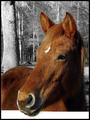
Hong Maby ShiiizzzamComment by jmsetzler: I like the profile shot of this horse quite a bit... the angle is very nice. The desaturation of the background also seems to work nicely here to help bring the horse out into the foreground more. The part of this photo that looks odd to me is the fence railing at the bottom. If there was some grain or texture on that rail to make it obvious as to what it is, I think it would be a stronger image. In the context of this photo, it looks like it could have been edited in rather than being part of the natural image. |
| 01/28/2004 06:35:05 AM |
Hong Maby ShiiizzzamComment by Harz_Joerg: Very crisp and clear! I do like the selective desaturation and how you framed it: due to the lower white part (is it a fence?) it apears to be very 3-dimensional. I have the feeling as if the head comes out of my screen. Good luck! |
| 01/27/2004 01:56:33 PM |
Hong Maby ShiiizzzamComment by sacrumastra: the composition is beautiful, but the white bar, I'm going to assume is a fence, is highly distracting. If it had been faded to a gray to match the background I think the affect would of been better. Overall a beautiful composition, and a beautiful horse too =) |
| 01/27/2004 10:25:54 AM |
|
| 01/26/2004 11:02:47 PM |
Hong Maby ShiiizzzamComment by barryg: I believe that is a fence rail on the bottom; a bigger crop to show that this was a railing would make the picture more appealing. |
| 01/26/2004 02:44:28 PM |
Hong Maby ShiiizzzamComment by Marjo: Beautiful capture of a beautiful horse/yearling? I love the background effect and the pose, but I find the very white rail in the foreground to be distracting. Color it gray and the photo would be awesome. |
| 01/26/2004 02:35:20 PM |
Hong Maby ShiiizzzamComment by scrum8: Don't normally like the shots where only the subject is saturated, but it works well here. |
| 01/26/2004 06:14:47 AM |
|
| 01/26/2004 02:27:18 AM |
Hong Maby ShiiizzzamComment by mrblobby: Once again I am not sure you are supposed to apply these sort of effects in this comp? It does look like a photoshop effect, correct me if I am wrong?
Foot note: Yes... I am wrong! Message edited by author 2004-01-30 01:35:20. |
| 01/26/2004 01:46:28 AM |
Hong Maby ShiiizzzamComment by carlacryptic: This is a good shot and the rich coloring of the horse is a good idea in contrast to the black and white setting. I don't like the white stripe at the bottom though - maybe that's where Year of the Horse would have gone, though, eh? |
Home -
Challenges -
Community -
League -
Photos -
Cameras -
Lenses -
Learn -
Help -
Terms of Use -
Privacy -
Top ^
DPChallenge, and website content and design, Copyright © 2001-2025 Challenging Technologies, LLC.
All digital photo copyrights belong to the photographers and may not be used without permission.
Current Server Time: 04/12/2025 09:25:41 AM EDT.