| Image |
Comment |
| 04/28/2008 08:54:24 AM |
Your sooo close!by HotspamComment by alanfreed: I'm thinking of implementing a 1-point "your tax" for entries that use "your" when they should have used "you're." |
| 04/28/2008 01:06:07 AM |
Your sooo close!by HotspamComment by Trinch: Love triangle?
Anyway, excellent job with the lighting. There is an overall balance with nothing too bright and nothing too dark. The composition and the subject's expression also works very well.
The negatives? The only issue is with the right hand. It's the only thing out of the focal plane and it is cropped at the knuckles. Besides that, top notch. |
 Photographer found comment helpful. Photographer found comment helpful. |
| 04/27/2008 03:51:35 PM |
|
| Photographer found comment helpful. |
| 04/25/2008 01:34:26 PM |
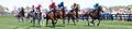
At the steeplechaseby HotspamComment by Eyesup: great capture of the cation! and I agree that the crop adds to the photo. A couple things I notice right off the bat is that there are som areas that are almost blown out... stopping down the aperature a little or speeding up the shutter would help.
Your compostion is quite centered, to add a more dynamic feel to the photo I might have composed for the bulk of the horses to be either more to the left or even more to the right (which I know is hard to do with fast moving action).
like I because with this is a good photo and it really captures the essence of the horse race. |
| Photographer found comment helpful. |
| 04/25/2008 01:33:30 PM |
|
| Photographer found comment helpful. |
| 04/23/2008 07:36:31 PM |
|
| Photographer found comment helpful. |
| 04/23/2008 10:27:19 AM |
Waitingby HotspamComment by JulietNN: wow never saw the girl until now. I wish she had been a tad brighter would have been cool. Mind you you beat me hands down, well done indeed!!! |
| Photographer found comment helpful. |
| 04/23/2008 02:03:38 AM |
|
| 04/21/2008 05:43:44 PM |
Waitingby HotspamComment by emerygirl25: The girl is hard to see, which i'm sure is the point. I really like the blue tint that you have. |
| Photographer found comment helpful. |
| 04/21/2008 10:05:25 AM |
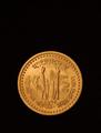
1 Taka - Bangladeshby HotspamComment by bspurgeon: Excellent subject, not sure about the negative space at the top. It does convey weight and gravity. Maybe this coin is the symbol of a crappy economy, bringing down a country! |
| Photographer found comment helpful. |
Home -
Challenges -
Community -
League -
Photos -
Cameras -
Lenses -
Learn -
Help -
Terms of Use -
Privacy -
Top ^
DPChallenge, and website content and design, Copyright © 2001-2025 Challenging Technologies, LLC.
All digital photo copyrights belong to the photographers and may not be used without permission.
Current Server Time: 03/11/2025 01:42:37 PM EDT.