| Image |
Comment |
| 04/03/2010 02:20:40 AM |
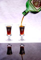
Hunter Masterby lectrolComment: b]Greetings from the Critique Club! [/b]
I think this image has a lot of potential. The composition, lighting and everything about the shot glasses, liquid being poured and the bottle is great. The only things that kept you from having a higher score was the background and the drastic change from the brightness around the shot glasses to the darkness of the reflections. It's too bad that you only had a towel to use as background, personally I wasn't a fan of the textures near the top. I still gave your picture a 6 though. I, and others, would vote higher with a little less harsh lighting and more gradual change in the reflection. Bottoms up!
If you have any questions click here to message me!
Senay |
| 04/03/2010 02:10:41 AM |
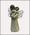
"Angel's Embrace" (CW)by JokersSoulComment: Greetings from the Critique Club!
First Impression: I feel that this just wasn't interesting enough, especially when compared to many very high quality images in this challenge.
Composition: Someone mentioned that the white background makes it seems that it is floating in nothingness. This works with it being an angel. Centered composition works fine for this angel.
Subject: I can picture this in a catalog advertising Christmas or Christian decorations. Unfortunately it just didn't have enough wow factor to get those higher votes.
Technical: To me the statue looks too dark. There's a lot of detail in all the cracks, or little edges.
Final thoughts: Congratulations on your new personal best!
If you have any questions url=//www.dpchallenge.com/messaging.php?action=compose&USER_ID=106543]click here to message me[/url]!
Senay |
 Photographer found comment helpful. Photographer found comment helpful. |
| 04/03/2010 01:47:37 AM |
|
| Photographer found comment helpful. |
| 04/03/2010 01:38:36 AM |
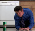
It is that easyby AtsugiComment: Greetings from the Critique Club!
First Impression: I got the idea you were trying to portray but there were a few things that could have been improved.
Composition: The very top of the picture has the background above the counter, actually I think it's the counter edge. Cropping just a little bit higher or lower and straightening the picture to include the counter as a small border at the top or to eliminate it completely would have been better than having a sliver of it diagonally. It's not super noticeable though so not a big detraction. Oh and one other thing would be to include a little more space at the very bottom. As it is now the Comet can is cut off.
Subject: Subject and message is good. I would have liked to see the man and Comet a little brighter with the dishwasher in the back a little darker. I like that the dishwasher is in it, gives you a location rather than just any random floor.
Final thoughts: My goal in every challenge is to beat my average and you succeeded in that, and congratulations on your picture making it into your top 5 highest rated on your profile. Good luck in future challenges!
If you have any questions click here to message me!
Senay |
| Photographer found comment helpful. |
| 04/03/2010 12:20:06 AM |
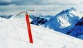
Black Diamondby keyzComment: Greetings from the Critique Club!
My first impression was whoa this person went all out on the challenge! The blue and red complement each other greatly. Somehow I got stuck with critiquing all the top pictures of the challenge, really not fair. Someone mentioned that there is dust in the background. This may be true but I think it might simply be snow falling. If it is in fact dust then it actually adds to the scene.
I do like this version better than your outtake. In the outtake the tool (I don't actually know what it is called) seems to be overshadowed by the mountain in the background. I also ike the wider landscape shown in this one.
It's a very good product shot with nothing to change or fix really, you should consider contacting Black Diamond :). Sorry I couldn't be of more help!
If you have any questions click here to message me!
Senay |
| Photographer found comment helpful. |
| 04/02/2010 02:45:26 PM |
|
| Photographer found comment helpful. |
| 04/02/2010 02:40:49 PM |
|
| Photographer found comment helpful. |
| 04/02/2010 02:37:38 PM |
|
| Photographer found comment helpful. |
| 04/02/2010 02:36:44 PM |
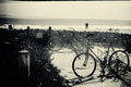
Beach pairs editby MelethiaComment: I like this one more than the colour. Starting yesterday it has finally been warm enough to go for bike rides. Wish I lived somewhere warm that I could do that year round. I'm jealous. |
| Photographer found comment helpful. |
| 04/02/2010 12:22:16 PM |
Hooch & JTby mandyturnerComment: Hello, I'm attempting to comment on all of the pictures on DPC that have zero comments on them.
This is almost frightening, ever see Cujo? |
Home -
Challenges -
Community -
League -
Photos -
Cameras -
Lenses -
Learn -
Help -
Terms of Use -
Privacy -
Top ^
DPChallenge, and website content and design, Copyright © 2001-2025 Challenging Technologies, LLC.
All digital photo copyrights belong to the photographers and may not be used without permission.
Current Server Time: 04/11/2025 09:08:17 AM EDT.