| Image |
Comment |
| 10/31/2003 10:27:18 AM |
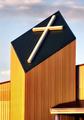
By His Grace I was saved ....by GrandmaEMTComment: not a crisp cross and the lower quarter of the photo should be cropped out. It's not a very interesting cross - it doesn't really cause me to reflect on the cost Christ paid, or the fact that he was the firstborn and so inherits the kingdom and so on... The building and roof only take away from the power of the cross. |
| 10/31/2003 10:23:34 AM |
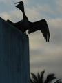
Pelican, Galapagos Islandsby kamilmComment: things shot in the shadows don't convey grace well. We can't tell what s/he is standing on and can barely tell what he is. The tree should get cropped out alltogether. |
| 10/31/2003 10:20:52 AM |
The Danceby Ram21Comment: underexposed. use PS to expose it better if you have no other lighting choices.
The photo is very busy...while dancers can convey graceful motion, this shot isn't helped by the plants, the chairs, and the other surrounding items. |
 Photographer found comment helpful. Photographer found comment helpful. |
| 10/31/2003 10:18:50 AM |
Teapotby SMW409Comment: First, how is this grace?
Second, there's a hand holding the subject of interest. This is a major distraction and a real no-no. Set it on the table if need be.
There's a harsh reflection coming off the teapot and off the background (which has a major shadow). Try using more natural lighting (or even pulling lamps over). |
| 10/31/2003 10:14:44 AM |
|
| 10/31/2003 10:12:16 AM |
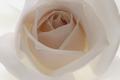
Eleganceby JeanComment: a heavenly feel to this rose created by it's color and the lighting to go with. It does lack a sustaining color, IMO. The center has the attention with the great circular-like lines that roses make. The focus seems a little soft laking sharp details on the rims of the pedals. Overall, it's still a good capture. (7) |
| Photographer found comment helpful. |
| 10/23/2003 01:25:59 PM |
Vegetarian Leatherby kosmikkreeperComment: i love the title. i think it needs a bit better lighting. there is a bright reflection off the center. it has dark edges on the left and bottom. |
| Photographer found comment helpful. |
| 10/22/2003 06:46:46 PM |
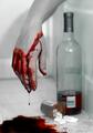
Escapeby seancComment: I definitely feel depression from this photo, but not so much all alone. However, I'm not gonna rate this based on that.
On the good side, you have a nice drop coming down and a good angle on the subject.
Things to improve upon: glare on the wine bottle, the wine bottle stands upright while the meds have spilled, the 'blood' doesn't look like it's flowed naturally, and the shadow from the flash (perhaps use some side lighting or reflectors).
Overall, good idea and decent execution. |
| Photographer found comment helpful. |
| 10/22/2003 06:41:16 PM |
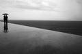
Grado, Italyby paolobnrComment: strong lines, strong elements of contrast.
definitely conveys a sense of 'all alone'. |
| Photographer found comment helpful. |
| 10/17/2003 01:16:37 PM |
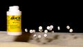
Happy Pillsby rll07Comment: nice idea, but it's blurry and has a nasty shadow from the container.
|
Home -
Challenges -
Community -
League -
Photos -
Cameras -
Lenses -
Learn -
Help -
Terms of Use -
Privacy -
Top ^
DPChallenge, and website content and design, Copyright © 2001-2025 Challenging Technologies, LLC.
All digital photo copyrights belong to the photographers and may not be used without permission.
Current Server Time: 03/12/2025 07:58:53 AM EDT.