| Image |
Comment |
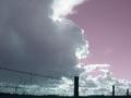
| 03/03/2004 10:48:15 PM |
Gloryby scwortmanComment: You must have raced to take this photo! The empty space is nice, especially with the fence at the bottom adding perspective. What I don't like is that the clouds end and there's empty sky, which seems to convey an unknown meaning. I think it would have been better with an empty sky or a completely cloud-filled one. |
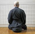
| 03/03/2004 10:46:50 PM |
zazenby bmatComment: Beautiful photo. I love the consistent tone of the robe and seat, as well as the horizontal stripes of the shade contrasting with the verticle ones on the wood floor. I don't know if this would look better black and white, but it's one of my favorites. |
 Photographer found comment helpful. Photographer found comment helpful. |
| 03/03/2004 10:45:30 PM |
In the Home of the Montain Haresby andywightmanComment: I like this picture, but I can't tell what's hiding behind the hump in the middle. Also, the trees lead the eye in kind of an arc, which is confusing because there's no real subject or focal point. |
| Photographer found comment helpful. |
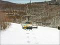
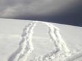
| 03/03/2004 10:44:37 PM |
Peaceful Ride Up the Mountainby alanfreedComment: I love the way you can see the shadows on the snow beneath. The structures in the top right are distracting, however, as is the bush on the right. Also, the angle muddled the lifts with the ones in front of them and it's a bit confusing. |
| Photographer found comment helpful. |
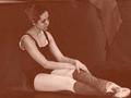
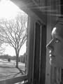
| 03/03/2004 10:42:42 PM |
A pauseby la magaComment: I think you were going for an old-fashioned look with the sepia tone but I personally don't like it. Also, the shoes and hair look almost negative in their tone. A good idea, but I don't like the way it was shot. It's also difficult to discern what the cloth is in the top right, and it's a bit distracting. |
| Photographer found comment helpful. |
| 03/03/2004 10:41:30 PM |
The Sun Shines Surelyby mystical_art_fanaticComment: Wow! The rays are captured nicely, and somehow you managed to keep the sun from being too distracting. I think it's because it's in the corner. Anyway, I like this shot. |
| Photographer found comment helpful. |
| 03/03/2004 10:40:26 PM |
Juste au milieu (Just in the Middle)by lisarelComment: Cool idea! I think black and white would be good for this shot, but it's not a very big deal. The open space at the top adds perspective, too. What's in the bottom right corner, though? A twig, perhaps? |
| Photographer found comment helpful. |
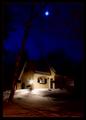
| 03/03/2004 10:39:31 PM |
By the Light of the Moonby mariomelComment: Good idea, but the moon could have been captured better. Also, obviously making it so bright made the lamp very bright, which a bit distracting. Two focal points in a photo is confusing to the viewer. Also, I wish the edges of the house were more defined and detailed. |
| Photographer found comment helpful. |
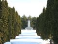
| 03/03/2004 10:38:20 PM |
Forever Silentby Links 2 3 4Comment: Good, original shot. But, I wish we were closer to the statue. It's almost difficult to tell what it is. |
| Photographer found comment helpful. |
| 03/03/2004 10:37:55 PM |
Shhhhhby 37vaComment: Good shot, it must have been challenging : )
I would only have liked to see a more original angle, and I think a color photo would really bring out the emotion more. |
| Photographer found comment helpful. |
Home -
Challenges -
Community -
League -
Photos -
Cameras -
Lenses -
Learn -
Help -
Terms of Use -
Privacy -
Top ^
DPChallenge, and website content and design, Copyright © 2001-2025 Challenging Technologies, LLC.
All digital photo copyrights belong to the photographers and may not be used without permission.
Current Server Time: 03/12/2025 02:18:52 AM EDT.