|
|
| Image |
Comment |
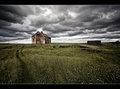
| 08/08/2011 03:57:15 PM | Old School House by StructorComment: It certainly has drama, and is certainly a nod to previous successful (let's say nordic) images that have cropped up here before. No doubt this will do well, and for it's own merits. Composition is nice (though would be tempted to see what it would be like a bit closer in without the rock wall on the right) but it does feel that there is a bit much going on (should i look at the building, or the yellow flowers, or both absorbing the scene; answered my own question there). The sky is very lovely and dramatic, and the grass a very nice windswept appearance which does draw your eyes up to the building. Building looks a bit flat and over sharpened, but the vignetting is tastefully done and it's still a very stylish shot.
My First Weighted Scoring System â„¢; composition + technical 2/3, challenge 1/1, post processing results 1.5/2, ooooh factor 1.5/3, originality 0.50/1 = 6.5 rounded to 7 |  Photographer found comment helpful. Photographer found comment helpful. |
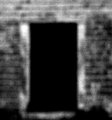
| 08/08/2011 03:49:29 PM | enterby jmritzComment: It's moments like this I wish you could change the grey to suit the photo; a black background would be so much more effective here. The use of negative space as the principal subject is striking to begin with, but the blackness of it begins to dominate too much and lessens the overall impact. Not being quite zoomed in might have improved composition a bit; and maybe rotated 90 degrees CCW? I like the style, though the level of noise is a bit counter productive. Is the blur in camera? A bit of softness would have corresponded with my sensibilities a bit more, but then that's an entirely subjective comment.
My First Weighted Scoring System â„¢; composition + technical 1/3, challenge 1/1, post processing results 1/2, ooooh factor 1.5/3, originality 0.50/1 = 5 | | Photographer found comment helpful. |
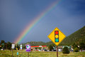
| 07/18/2011 02:54:42 PM | How to Photograph a Rainbowby hahn23Comment: Well, yes, it̢۪s certainly a rainbow and it has been photographed. But so much detracts from it :/ You may have been stuck in a car so limited with where you could take it, and no doubt this was an opportune moment; but seriously that road sign is a major bummer. Toning down the contrast and maybe a little Gaussian blur in the foreground could have lessened the impact of the sign and the petrol station, but parking up somewhere and using those seemingly lovely mountains lessening the human element might have helped the natural beauty in what is, accordingly with the title, a nicely realised bit of rainbow.
My First Weighted Scoring System ™; composition + technical 1/3 (for the rainbow element), challenge* 1/1, post processing results 0/2, ooooh factor 1/3, originality 0.5/1 = 3.5 rounded to 4 (* I don’t think it’s possible to not meet the challenge on this one so everyone gets a 1/1) | | Photographer found comment helpful. |
| 07/18/2011 02:48:14 PM | Flamingo Dual(Dodge and Burn)by sfmorrisComment: A very effective and successful use of the D&B technique. It̢۪s a good, very interesting and involving nature shot, nicely composed and the level of detail is just really lovely. You̢۪ve also shown how dodging and burning works, and shown some restraint without overdoing it (so easy to do). Slightly wish his head and neck was a bit brighter, and I feel the whole thing is not as pink as it could be (pre-conceived flamingoism I̢۪m afraid) but otherwise a stand out job.
My First Weighted Scoring System ™; composition + technical 2.5/3, challenge* 1/1, post processing results 2/2, ooooh factor 2.5/3, originality 1/1 = 9 (* I don’t think it’s possible to not meet the challenge on this one so everyone gets a 1/1) | | Photographer found comment helpful. |
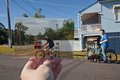
| 07/18/2011 02:43:57 PM | Dear Photograph - she still likes riding bicycles!by BeetleComment: Nifty. This is so Kodak. There’s much to like about this; the nice bold primary colours (especially comparing the shiny now with the slightly aged look of the then), the mix of focus, the whole concept, it’s originality, and the fact it genuinely tells a story. Minor criticism is that I’d like to see it a little narrower, maybe have the background a bit more in focus (though the way it is doesn’t really detract) and I think if she was riding her bike with the dog on the luggage rack that might be a bit more ‘through the ages’ kind of thing. Cool Toyota too. I really like this; had a good honest solid warmth about it and doesn’t feel remotely as contrived as a lot of stuff you see.
My First Weighted Scoring System ™; composition + technical 2.5/3, challenge* 1/1, post processing results 2/2, ooooh factor 3/3, originality 1/1 (I’d give it a bonus if I could) = 9.5 rounded to 10 (* I don’t think it’s possible to not meet the challenge on this one so everyone gets a 1/1) | | Photographer found comment helpful. |
| 07/18/2011 02:34:10 PM | Enhance Photo Contrastby TheDruidComment: Oh. I’m not sure ‘enhance’ is the right word, or at least on a personal level. If anything, it’s anti-contrast. I think I might have been inclined to make it whiter in tone rather than the bluey grey you have gone for; go full minimalism. I have a feeling this isn’t going to do well, but, it’s not a bad photo. It’s a little too ill-defined perhaps, but in conveys an atmosphere, and ambience and really, how else are foggy conditions along the coast going to come out? Can’t say it’s quite my cup of tea, but it has something. It’s not a ten second review shot. And it’s one of the few photos I can actually hear.
My First Weighted Scoring System ™; composition + technical 1/3, challenge* 1/1, post processing results 1/2, ooooh factor 2/3 (it’s a grower), originality 1/1 = 6 (* I don’t think it’s possible to not meet the challenge on this one so everyone gets a 1/1) |
| 07/18/2011 11:25:11 AM | (Rescuing over and underexposed images)by njsabsComment: So, did you purposely take a duff photo to make it all shiny and nice after? If so, job well done! It̢۪s a characterful quality pet picture; the colours are really rich in complementary shades and hues, the focus is very nicely handled, and the dog̢۪s expression is very, erm, expressive. His handwriting is a bit too neat to be fully convincing, and possibly the question mark is redundant (yes, I know, silly criticisms), but otherwise mildly amusing but more importantly very slickly done. Doesn̢۪t look like a rescued photo at all, which I guess is the point.
My First Weighted Scoring System ™; composition + technical 2.5/3, challenge* 1/1, post processing results 2/2, ooooh factor 2.5/3, originality 1/1 = 9 (* I don’t think it’s possible to not meet the challenge on this one so everyone gets a 1/1) | | Photographer found comment helpful. |
| 07/18/2011 10:53:53 AM | The beauty of smokeby hajekaComment: It is quite pretty, so scores well on the initial ‘oooh’ factor, but isn’t stay super interesting. I think I might have cropped a chunk off the left too; it would I think make the flowness more dynamic, plus the areas of void doesn’t really help and unbalances the overall appearance. The blue hue works well though, and it is very nicely illuminated. As a rule I don’t let borders influence my scoring; but if I did I’d have thought the blue line clashed a little bit, and it feels a bit too 80’s to me.
My First Weighted Scoring System ™; composition + technical 1.25/3, challenge* 1/1, post processing results 1/2, ooooh factor 2/3, originality 0.25/1 = 5.5 rounded to 6 (* I don’t think it’s possible to not meet the challenge on this one so everyone gets a 1/1) | | Photographer found comment helpful. |
| 07/18/2011 09:25:34 AM | Wildlife Photography Tips: Take Better Wildlife Photosby mbrutus2009Comment: Initially unconsidered reaction would be it̢۪s a bit too dark but at the same time washed out without the blacks being quite bold enough. The appearance suggests to me that burning and dodging seems a bit overcooked (I̢۪m more than guilty of doing that myself) but not enough to make the main subject of the image leap out at you. Possibly all it needs is a quick boost on the contrast? Composition is also a bit off in my mind; feels a bit inverted (not the word I̢۪m looking for).
As a rule, I don̢۪t let borders influence my scoring; if you buy a print you can always change the frame. However, I would imagine you̢۪ll get a couple of negatives on this one; not widescreen enough to be cinematic, or just looks like the ends are missing.
My First Weighted Scoring System ™; composition + technical 1.5/3, challenge* 1/1, post processing results 1/2, ooooh factor 1.5/3, originality 0.5/1 =5.5, rounded to 6 (* I don’t think it’s possible to not meet the challenge on this one so everyone gets a 1/1) | | Photographer found comment helpful. |
| 07/18/2011 08:20:24 AM | Layer Masks/Curves Adjustment Layersby GeneralEComment: I do like how you̢۪ve demonstrated the difference between having the tutorial and not, but in this case didn̢۪t think the image you have used is particularly well suited in an artistic sense. The place where the split happens doesn̢۪t seem to have a reason; acts only as distraction. Possibly something with two distinct sides having the processed side complimenting the other side might have been more effective? I do like the final result of the processed side; makes for a more interesting and arty image and it does demonstrate how effective and creative such processing can be. Just a pity the split is so jarring. In two minds about the composition too; I love the little glint of sunlight at the top, but think possibly would have been more satisfying if you made it squarer by cutting off the top midway up the side of the bridge (i.e. no car, barrier or sky).
My First Weighted Scoring System ™; composition + technical 2/3, challenge* 1/1, post processing results 1.5/2, ooooh factor 1.5/3, originality 0.5/1 =6.5, rounded to 7 (* I don’t think it’s possible to not meet the challenge on this one so everyone gets a 1/1) | | Photographer found comment helpful. |
Home -
Challenges -
Community -
League -
Photos -
Cameras -
Lenses -
Learn -
Help -
Terms of Use -
Privacy -
Top ^
DPChallenge, and website content and design, Copyright © 2001-2025 Challenging Technologies, LLC.
All digital photo copyrights belong to the photographers and may not be used without permission.
Current Server Time: 04/02/2025 12:16:27 AM EDT.
|