| Image |
Comment |
| 07/20/2004 04:28:05 PM |
|
 Photographer found comment helpful. Photographer found comment helpful. |
| 07/20/2004 04:25:18 PM |
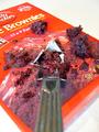
Right Out of the Boxby aguinnComment: I like the idea behind this photo! I like the fork where it is...I think that it gives the onlooker the apeal that YOU are eating the brownie mix out of the package! Around the edges, the photo seems to be blurred. The photo could be more clear and concise! |
| Photographer found comment helpful. |
| 07/20/2004 04:22:14 PM |
|
| 01/27/2004 06:56:19 PM |
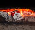
The best way to somke emby RasaiComment: This is a really cool photo. I like the moral behind the photo. You got a really nice shot of the fire, and I like how you made the cigarettes your main image!
One thing, the top half of the picture is too dark, it makes too much of a contrast between the bright flame and itself. You might want to enhance that part of the photo. Other than that...great job!
geschlechtmann27
Critique Club :) |
| Photographer found comment helpful. |
| 01/26/2004 08:52:03 PM |
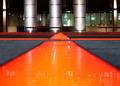
Fissuresby ImagineerComment: In this photo, you did an awesome job showing perspective! I think that the glare from the images takes away from the photo a bit, but not too much!
Lighting is done very well in this photo. I think possibly you might want a different stand point to make the photo more symmetrical! I like how you open the photo with this very orange-red runway. It adds a lot of character to the photo! Great Job with this piece!
geshlechtmann27
Critique Club |
| Photographer found comment helpful. |
| 01/26/2004 05:58:14 PM |
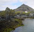
Mysterious lonleynessby asijComment: This photo is great! The texture of this photo is magnificent. The front cliff jumps out at you! The back mountain/hill and house seem very unreal.
Towards the back of the photo it begins to get very blurry. This may be a contributing factor in the unreal-ness! I really enjoy the contrasting greens and blacks. Overall good photo.
geschlechtmann27 |
| Photographer found comment helpful. |
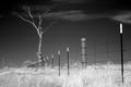
| 01/26/2004 05:53:03 PM |
Untitledby aperture_disasterComment: This is a nice perspective photo. I like how you can look down the "road" and it seems to disapear. This is a good black and white photo.
It seems as if you took something out in the background. If you are going to take something out, try to blend what is left more! Other than that nice black and white composition.
geschlechtmann27
Critique Club |
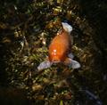
| 01/26/2004 05:48:33 PM |
HERE'S LOOKING AT YOUby joleneyng1Comment: This is a good example of Point of View. The photo is a little unclear, but that is probable in water.
It seems as if on the lower right hand side of the photo there was a glare, in your upcoming photos try to get rid of this. Also towards the edges of the photo it is very dark...this takes away from the photo. Nice job other than that!
geschlechtmann27
Critique Club |
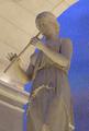
| 01/26/2004 08:13:46 AM |
The Art of the Romansby nsoroma79Comment: This is a good example of lighting. I am glad that you used the clone tool to cut the ceiling distractions. It looks much smoother and is easy on the eyes. Some of the photos you can tell that they took something out, but on this one I cannot tell! Great Job.
The blue background takes away from the photo. The eye wants to go towards the blue because it is the only color. Other than that, good job!
geschlechtmann27
Critique Club |
| 01/26/2004 08:08:50 AM |
Romanic Architecture of the 11th Centuryby Harz_JoergComment: Great example of architecture! Overall this photo is great. The repetition of column textures. The texture of the snow! Overall texture.
The lighting of this photo is a little dull. Your perspective is great. The slant of the photo gives the eye somewhere to move. Movement is great in a still life photo! If I were the editor of National Geographic your picture would definately go in this issue! Great Job.
geschlechtmann27
Critique Club |
| Photographer found comment helpful. |
Home -
Challenges -
Community -
League -
Photos -
Cameras -
Lenses -
Learn -
Help -
Terms of Use -
Privacy -
Top ^
DPChallenge, and website content and design, Copyright © 2001-2025 Challenging Technologies, LLC.
All digital photo copyrights belong to the photographers and may not be used without permission.
Current Server Time: 03/12/2025 02:00:46 AM EDT.