DPChallenge: A Digital Photography Contest You are not logged in. (log in or register
 
Browse Settings
Currently viewing:
Registered Usertristalisk

Show comments:

Per page:

Order:

Comments:


Comments Made by tristalisk
Pages:   ... [81]
Showing 1 - 10 of ~804
Image Comment
Bubba Bubbly - DNMC? You may be a redneck.
03/09/2006 11:45:59 AM
Bubba Bubbly - DNMC? You may be a redneck.
by cislander

Comment:
Greetings From The Critique Club!!

Initial impact: Colorfull but what challenge is this for?

Meeting the challenge. It took me a moment to catch it but I will agree that it is quite the "odd couple".

Color: Lots of color on the red cups but I thing a bit more light maybe shining through the bottom of the bottle would help pop out the greens and show off the bottle a bit more.

Lighting: Not to bad but with the bottle light and a back light to even out the reds and shadows it would have looked crisper and a little more catching IMO.

Sharpness: It is a fairly crisp image but it looks like you DOF may have been a little shallow. The daqrker back cups look to be a little OOF.

Composition: To crowded and busy for me perhaps just one cup tipped over beside the bottle would have delivered a more wowerfull message. The beauty of the bottle is lost in the clutter of plastic.

Over all: Not a bad shot. Technicaly it pretty good, it has some appeal in it's conveying a message and telling a story. Wich are always huge pluses in my book. The dirty nature and shadows of the cups makes the the image unapealing. It definately conveys the message and challenge well But it lacks the "eye candy" appeal to realy go further with DPC voters. Best of luck in future challenges.

Tristalisk

Photographer found comment helpful.
My Waiting Angel
03/09/2006 11:31:24 AM
My Waiting Angel
by Little King

Comment:
Another well thought out reason to put scantly clad women in a photo. Thank you.. Good lighting, Good focus, exelent color, the composition works well. The wings, look good, enjoyable image, and fits the challenge. 10
Photographer found comment helpful.
Reunited
03/09/2006 11:29:05 AM
Reunited1st Place
by Keith Maniac

Comment:
Well What can I say I like it.. One of my two 10"s this challenge.
Photographer found comment helpful.
Decades Apart
03/08/2006 03:06:21 PM
Decades Apart
by LN13

Comment:
Greetings From the Critique Club!!!

Initial Imapact: WOW thats good!!

Meeting the Challenge: I didn't even have to look to see that this was clearly for the Odd couple challenge.

Focus: Dead on. It can't possibly get any better than this.

Color: I like the drab green But I feel that the mouse and pad Could use a bit of color to help it feel even more "modern". The tonal range and colors that are present are all perfect.

Composition: Oce again looks great.

Lighting. This is the only area I can spot any technical aspects that could be improved. I don't like the shado on the left of the typewritter. I think Using another light from the left to remove it would have moved this great shot up another knotch.

Overall: Not a real exciting subject. Or necessarily pretty. This will probably keep this image away from the ilusive ribbon, but I can easily see this as a stock image or a poster. This image make lack in aqppealing to the masses but it is technicaly a spectacular photo.

Keep up the great work!! I look forward to voting on more entries like this one.

Tristalisk
Photographer found comment helpful.
clothed for the juncture
03/08/2006 10:17:41 AM
clothed for the juncture
by floydrowe

Comment:
Greetings From The Critique Club!!!

Initial impact: Why??

Color: There is not a lot of color in this photo but The concept is sound. Placing almost all of the color in the center does force the eye to look at the figure in the middle

Focus: The focus is very good, but I feel that you Depth of Field is a little shallow. I think that in this instance it would have worked a bit better to have A nice crisp focus for the full depth of the photo.

Contrast: The contrast looks to be good. I can't see anything in this area that could be improved.

Lighting: This is one of the weak areas in this photo IMO. It looks like you were trying to get a solid white background, but instead you ended up with a lot of greys and off whites. T fix this you would need to move your subject away from the background a little more and light it separately. Shop lights or a good flashight will accomplish this if you don't have access to studio lights and such. As for lighing the subject. When shooting on a white surface you ussualy want to have the appearance of the subject floating in free space. This is accomplished by removing as many shadows as possible. And making sure you subject is as vibrantly lit as possible. In this instance I would have tried using two more loghts from either side as low as possible. This would allow the light to illuminate as much of the white surface as possible giving you the least shadows. With those three lights and you cameras flash the subject would have apeared to be floating in white.

Subject: It looks to be a random pile of objects to me while each one is interesting in it's own right I can't see a relationship between the items. I realize this is an odd couples challenge, but I feel that there should be some reason or relationship between the different subjects. Why were the grapes and green rose added? What did they add to the photo. What is the Odd couple relationship between the pink dol and the stuffed lion? I was unable to get a story or meaning behind this photo. I feel that if there was one it may have been a bit too obscure for me and the other viewers to make the connection.

Best of luck in future challenges, and remember perfection comes with perseverance.
Photographer found comment helpful.
Le Femme Noir
03/07/2006 08:29:58 AM
Le Femme Noir
by irakly

Comment:
Greetings From The Critique Club!!!

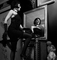
Initial Impact: Hey this kinda looks like than Inesca womans work. Not sure what the photographers name was, but this has a strong resmblance to some of her work I saw at a show in Sacramento a few years back.

Meeting The Challenge: Yep. I do wish that more detail was visible on the outfit for challenge reasons, but I feel that lightenting it up to do so would totaly destroy the feel of the image.

Focus: Not you typical liquid smooth razor sharp DPC ribbon winner but not all images need to be or look good in that fashio. This has a nice focus and a good DOF. The grain looks "classic" nad not just noisy or badly shot. Very nicely done. (I myself have been afraid to venture as far as intentionaly adding grain)

Contrast: Very nice contrast good lights, darks and a smooth greyscale.

Subject: I like it once again this has a very classic feel.

Lighting: I never thought I would say this, but your lighting isn't harsh enough. At least not in the rest of the room. The hash lighting on the woman contrasts too much with the smooth soft lighting of the room. Was this intentional? No telling just looks off a bit to me.

Composition: Pretty good, but it could be a bit better IMO. Firt I have a phobia about people with missing feet. I would feel a bit more comfortable if the feet had not been cropped out of the shot. Second I would like to have just a hair more space behing the woman on the left. This would pull the woman back to the thirds mark and give it a little better feel.

Overall: a pretty nice classic image. I gave this one a 7 but if my mood had been better I might have gone with an 8. Great job. I look forward to seeing what creative ideas you come up with next.

Tristalisk

The Cuyahoga Valley National Park
03/06/2006 01:03:03 PM
The Cuyahoga Valley National Park
by EaThis

Comment:
Greeting From The Critique Club!!!

Initial Imapact: eehh... nice color......

Meeting the challenge: It definately does. I can't agrue with that.

Color: Sepia was a good choice for this image but I think the color may be just a little too saturated. Toning it back a little might help this get more of the rustic photo feel.

Contrast: Not a whole lot of contrast her exept for the dark on sepia. I think this could have benifited fro an little bump in the contrast. It would have brought aout eh details better on both the bridge lines and the trees. As it is the image feels flat.

Focus: Not to bad but it looks to be just a little soft. Once again causing you subject to fad a bit to much into the background.

Composition: The composition dosn't sit very well with me. The bridge running from corner to corner. It feels like it is running of the page. It no longer feel s like the center of intrest. This would have greatly benifited with a bit less of an angle on the bridge and a little smething to help anchor the subject down in the middle a bit more.

Overall. The copostion is a big draw back. This could probably have been compensated for by bumbing the contrast and easing off the sepia a bit. Not a bad image but with a little Time and effort this could have been a great photo.

Tristalisk
Pastor
03/06/2006 12:49:40 PM
Pastor
by Brin

Comment:
Greetings From The Critique Club!!!

Initial inpact: WOW!! What a powerfull and dark image!!

Contrast: Good contrast whites, Blacks and everything in the middle.

Composition: Normaly I don't like the main subject to be in the ddead center of the image. But in this situation I think it works well. The reflections frobably would not have looked quite as impressive otherwise.

Story: I feel this image tells a story and keeps the viewers interested. The back ground is a spectacular use of freco's and the "dark" preist realy seems to go with the mood the the frescos and the overall darkeness of the image. This is definately not you typical pretty church shot. It is easy to imaging the preist ranting and raving about fire and brimstone. Very effective photo.

Focus: Dead on focus. Nice crisp image through out. There isn't much more to say than that about the focus.

Complaints: It took me second to find the preist amidst the rest of the spectacular details. I perhaps a darker lit back ground with a bit of a spotlight on the preist would have helped with this.

Overall a very nice image. I would have voted this one very highly had I voted on that challenge. Nicely done. I look forward to seeing more of these breathtaking photos from yet another Icelander:)

Tristalisk

Photographer found comment helpful.
Cosmetic Fashionista
03/06/2006 11:53:34 AM
Cosmetic Fashionista
by nsoroma79

Comment:
Greetings From The Critique Club!!!

Initial impact: Nice shot but Way too much (blush?).

Color: I realy love the soft pink hues that drift through this photo. And the flesh tones are wonderfull. I have nothing to offer that could possibly improve in this area.

Contrast: The dark hair and eyes are most of the contrast in this shot. (which is fine). It is over expossed and the whites are so bright that it blows out some of the details such as wrinkles and such on the sheet. (which looks great!) This is a spectacular exaple of how to break the rules and succeed. I love it.

Composition: Nice Point of veiw. Good angle. Rule of thirds, nice balance. Looks great.

Border: I agree with the others on this one. The black border is a bit bold and pulls you away from the soft image. Perhaps a white border. With a few think black stripes or somthing of the sort would have worked better.

Overall: While initialy I did not like the make-up It quickly grew on me as an integral aspect of this photo. The soft tones and pinks mesh wonderfully. And the model is pleasing to the eye as well. Overall I would have to say this is most definately a beautifull photo you can be proud of. And bieng a self portait is just icing on the cake. Great job!!

Message edited by author 2006-03-07 12:40:20.
White As Snow
03/06/2006 11:37:20 AM
White As Snow
by RockBruise

Comment:
Greetings From the Critique Club!!!

Initial Impact: I like it....

Color..... umm I guess this catagory is a bit poinless in this photo.

Focus: I like it nice and crisp lines everywhere. The road, the church, the tress all in perfect focus.. This alone wins a few points in my book.

Contrast: I see that most think this could have used a bit more contrast. I agree with them to an extent. I like the monotone and gey feel of this image. But it does feel a little flat. I think a little burning would make everyone hapy. Maybe burn the sky a little to bring out the clouds a bit more. And just a light pass with the burn tool over the trees to give this more depth using dark to ligh with a midline.

Composition: I like it.. Rule of thids was used. It has a nice balance and natural feel. I even like the border.

Overall I voted this image pretty high. I gave it a 7 during the challenge. I think with a little use of the burn tool this could have easily received an even higher score. Wonderfull photo.. I look foerward to seeing what you come up with next..

Tristalisk
Photographer found comment helpful.
Pages:   ... [81]
Showing 1 - 10 of ~804


Home - Challenges - Community - League - Photos - Cameras - Lenses - Learn - Help - Terms of Use - Privacy - Top ^
DPChallenge, and website content and design, Copyright © 2001-2025 Challenging Technologies, LLC.
All digital photo copyrights belong to the photographers and may not be used without permission.
Current Server Time: 04/02/2025 11:54:25 AM EDT.