| Image |
Comment |
| 04/26/2005 02:43:59 PM |
|
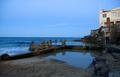
| 04/26/2005 02:43:19 PM |
|
 Photographer found comment helpful. Photographer found comment helpful. |
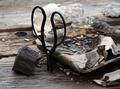
| 04/26/2005 02:21:42 PM |
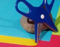
rockin sissorsby lightningComment: I see the rocks but not quite sure what the stuff is around the scissors. The scissors are a little dark towards the bottom. |
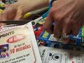
| 04/26/2005 02:18:55 PM |
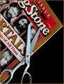
Clippin' Photography Couponsby dcjoesComment: Nice suttle hint at the rock portion of the challenge by throwing in the ladies "ROCK" on her hand. Got some blown out on that paper she is holding other wise a image much like the others submitted. Good luck. |
| Photographer found comment helpful. |
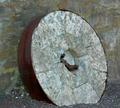
| 04/26/2005 02:17:07 PM |
rock wheelby gtp1164Comment: Interesting subject, wonder if it was to an actual vehicle of some sort or mabe a grinding wheel. Your arrangement is good it seems a little dull (of course there isn't a whole lot of color anyway) but still a good image. Good luck. |
| 04/26/2005 02:14:59 PM |
Lonehill Koppieby KarGirlComment: This image I think would be better with a little help, first try a different angle to get rid of all those antennia things and the buildings blocking your view (maybe even the tree). Second your colors are a little washed out, see if adjusting the curves or levels will help that. Last your focus appears to have picked the tree, leaving the rocks...your main subject...blurry. while some building or tree in the image would probably not hurt the image I think here it hurts it. Good luck |
| 04/26/2005 02:11:08 PM |
From the Desk of...by hopnjohnComment: dem scissors are FAT! Interesting setup with nice variety of colors but I still feel it lacks punch. the rock and scissors appear a little blurred and the curl in the yellow piece corner keeps drawing my eye to it. |
| Photographer found comment helpful. |
| 04/26/2005 02:09:34 PM |
Another Page for the Scrapbookby tryals15Comment: While the border is different from the norm I find it distracting from the actual image. Your scissors seem a little blurry and colors (what is there anyway) are dull and dark. Maybe some more contrast would help. Good idea that isn't too much like the normal submission for this challenge. |
| Photographer found comment helpful. |
| 04/26/2005 02:07:44 PM |
He-He, Rock Wins!by hughletherenComment: Interesting, love the stone color and your lighting...how'd you get the tip of the stone to glow like that. I think I would have preferred the stone on top of the scissors with your title but still a nice image. Good luck |
| Photographer found comment helpful. |
| 04/26/2005 02:06:29 PM |
Cutting Edge Mediaby tfarrell23Comment: Good lighting and arrangement, clear, sharp (pun intended) image. Love your hint of rock in there. Good luck |
| Photographer found comment helpful. |
Home -
Challenges -
Community -
League -
Photos -
Cameras -
Lenses -
Learn -
Help -
Terms of Use -
Privacy -
Top ^
DPChallenge, and website content and design, Copyright © 2001-2025 Challenging Technologies, LLC.
All digital photo copyrights belong to the photographers and may not be used without permission.
Current Server Time: 04/22/2025 12:28:42 AM EDT.