| Image |
Comment |
| 06/09/2006 05:19:09 AM |
Engrossedby margiemuComment: double post. i suck.;p Message edited by author 2006-06-09 05:21:38. |
 Photographer found comment helpful. Photographer found comment helpful. |
| 06/09/2006 05:16:23 AM |
Engrossedby margiemuComment: CTPII
Hey Marge. Didn't get to vote this, actually, but I would've given it an 8. It's very well done, IMO.
Again, I'd've gone for a tighter vertical crop for this, drastically lessening the black negative space and and giving the viewer that almost "claustrophobic" feel.
But that's just me.;p |
| Photographer found comment helpful. |
| 06/09/2006 05:07:52 AM |
the Agony of Defeatby margiemuComment: CTPII
Hey Margie, great job. A 6+ and a top 20 (almost a top 10!). You even got a comment from Mr.Cuesta. Ah, envy.
Didn't get a 1. Now that's rare.
The skin texture and the expression did wonders for the shot. So is the slight (intentional) under-exposure.
Congratulations on your PB. You did well, ma'am. |
| Photographer found comment helpful. |
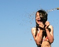
| 06/09/2006 04:57:32 AM |
Relief from the Heatby margiemuComment: CTPII
Wa-hey... why the low score? I just don't get people... this was one of your best shots, maybe even the best.
The water's mid-air freeze and your kid's expression made this shot, IMO. Nice vibrant colours, too.
Should've scored higher.
Personally, I'd go for a tighter, vertical crop -- cutting off the hose and some of your girl's body. A little sharpening would've helped, too, I guess.
A nice photo, all in all. |
| Photographer found comment helpful. |
| 06/09/2006 04:49:17 AM |
down timeby margiemuComment: CTPII
There's a pretty straightforward SP. No gimmicks, just photography.
Although I'm all for "experimental" photography, straightforward works for me as well. You did a great job on this, minus minor nitpicks that can be addressed in PP.
One question: was your teeth clenched? Your expression give me the impression that it was. |
| Photographer found comment helpful. |
| 06/09/2006 04:40:42 AM |
Here comes the sunby alexgarciaComment: CTPII!
Hey dude. My crit for this particular shot is going to be a reversal of my crit on your previous shot.
Sunrises and sunsets are great choices for a subject. However, what's lacking in this particular shot is color punch. There's little color and tonal variations in here. Also, a tighter crop would help, IMO, as it would've given the shot "more focus".
There's also a little fringing/haloing all over the photo. Dude, ease up a bit on sharpening. Or use smart-sharpen. Message edited by author 2006-06-12 10:14:52. |
| Photographer found comment helpful. |
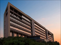
| 06/09/2006 04:31:56 AM |
Dawnby alexgarciaComment: CTPII!
Hey, nice colours. i mean great colours. Can't say much about the building, though. Pretty drab, actually. Also, there's a bit of fringing on the edges of the building. A little less sharpening next time, perhaps? |
| Photographer found comment helpful. |
| 06/07/2006 11:05:12 PM |
|
| Photographer found comment helpful. |
| 06/07/2006 11:02:00 PM |
Light Study #13by esdarbyComment: This was one of my better scored entries for this challenge. Should've placed higher, IMO. It has an Old Master Painter ly feel to it, minus the paint.
I liked it, basically. |
| Photographer found comment helpful. |
| 06/07/2006 10:50:42 PM |
Memoirsby LalliSigComment: Heh. So it WAS lit with a single (albeit compound) light source. Very good, sir. Well done.
|
| Photographer found comment helpful. |
Home -
Challenges -
Community -
League -
Photos -
Cameras -
Lenses -
Learn -
Help -
Terms of Use -
Privacy -
Top ^
DPChallenge, and website content and design, Copyright © 2001-2025 Challenging Technologies, LLC.
All digital photo copyrights belong to the photographers and may not be used without permission.
Current Server Time: 03/12/2025 03:23:38 AM EDT.