| Image |
Comment |
| 04/07/2006 08:42:59 AM |
Fairytaleby kosmikkreeperComment: Little blown out on the horses nose...no seperation between it and the background. But the idea is cute and the children are adorable! |
 Photographer found comment helpful. Photographer found comment helpful. |
| 04/07/2006 08:40:23 AM |
|
| Photographer found comment helpful. |
| 04/07/2006 08:39:55 AM |
We just had a Fightby arvinderComment: My eye keeps going to the line down the back...was this intentional to try splitting them or just happened to be there? Either way for me it is a little distracting. Nice clear shot though...good details on them. |
| 04/07/2006 08:37:34 AM |
downward spinby xtineComment: I keep trying to turn the picture. I know that you were trying to make it look like a downward spin but personally I would have rated it higher if the picture was going the correct way. I like the idea though. |
| Photographer found comment helpful. |
| 04/07/2006 08:34:53 AM |
Lou Louby manic35Comment: Ok maybe its because I am obsessed with hands....but I love this shot. Good detail and color choice. |
| Photographer found comment helpful. |
| 04/07/2006 08:32:37 AM |
Abandonedby JutildaComment: Like how you tilted the camera to show a different angle on the subject. If this would have been a straight on shot wouldn't have done anything for me but because of the tilt it has great leading lines. |
| Photographer found comment helpful. |
| 04/07/2006 08:27:31 AM |
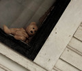
Ah, Where to Startby bledfordComment: Would have rated it higher if the baby wouldn't have been positioned so dead center. Try playing around with rule of thirds. Love the color and the lighting technique. |
| Photographer found comment helpful. |
| 04/07/2006 08:23:26 AM |
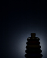
Ringstackby conglettComment: A lot of noise which I know can't really be edited out in this challenge. Neat idea though. Wish it could have had a touch more color though but then again then you wouldn't be getting the backlight affect so....? |
| Photographer found comment helpful. |
| 04/07/2006 08:18:21 AM |
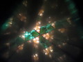
Kaleidoscopicby SikLitlMunkiComment: Neat idea. Would have given it a higher score if it was a little brighter on the colors. |
| Photographer found comment helpful. |
| 04/06/2006 08:59:36 AM |
Whirl Windby photobug2325Comment: Have to agree with everyone. Deserved a low score. Don't know what I was quite thinking entering it but I really kinda liked the artistic look of the blur and the washed out. Maybe it is because I have never shot anything like this that I thought it was different and unique. It reminded me of a painting. But now the more I look at it, I see it from a professionals point of view and see all the technical errors. I figure though I can only get better from here and now I am beginning to see what others vote higher scores on so that helps too! |
Home -
Challenges -
Community -
League -
Photos -
Cameras -
Lenses -
Learn -
Help -
Terms of Use -
Privacy -
Top ^
DPChallenge, and website content and design, Copyright © 2001-2025 Challenging Technologies, LLC.
All digital photo copyrights belong to the photographers and may not be used without permission.
Current Server Time: 03/12/2025 08:01:11 AM EDT.