| Image |
Comment |
| 04/28/2006 01:57:08 PM |
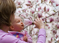
Pedalsby beermanComment: Pedals are on a bike. Petals are on a flower.
Great composition, I would have liked to see a larger DOF, but what you chose to focus on was good. but I love the curves, and the nice punchy colours. |
| 04/24/2006 11:44:55 PM |
New Sensationby tateComment: So much pink! ouch! Hehe. Personal bias against pink aside, good solid photo. Great focus, it's where it needs to be, and despite the lightness of all the colours, and the predominance of white in the background, it doesn't seem too bright. Good Job. |
 Photographer found comment helpful. Photographer found comment helpful. |
| 04/24/2006 11:40:39 PM |
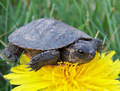
Spring's New Lifeby bs-photosComment: My first reaction to this was "what the hell?!" and then I started laughing. hehe. I like it. great texture, and colour contrast. |
| Photographer found comment helpful. |
| 04/24/2006 11:36:49 PM |
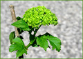
New Spring Growthby freakin_hilariousComment: I think the border was a bad decision for this shot. While it does a good job of encasing the photograph, the color being almsot exactly that of the plant detracts from the impression that so much green makes against the field of white in the background, and again with the brown stake. Setting this aside, the color of the image is great, nice and simple. Excellent focus, and the bug makes it more interesting that it might have been. |
| Photographer found comment helpful. |
| 04/24/2006 11:28:46 PM |
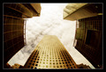
New Buildby srichmondComment: I feel like it should be rotated a couple degrees counterclockwise, but other than that, it's an impressive image. I love that the detail remains in the clouds, so that it's not simply a wash of white, but a presence above the buildings. |
| Photographer found comment helpful. |
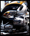
| 04/24/2006 11:26:54 PM |
Germaneeringby jgm5015Comment: New word, too? Hehhe. Germaneering has a nice ring to it. I like it.
Nice colour and contrast. It could stand to be a bit sharper, and it's a little overwhelming, there's a lot going on, and it lacks focus. (by this I don't mean actual sharpness, I mean a place that draws the eye.) The reflections are interesting. If I were to change it, I'd crop it closer to the top, so the BMW crest is more prominant, and some of the more distracting and busy chrome is cropped out. This way, the curvy lines along the body would draw the eye up to the crest, and there would be a stronger contrast between the black and the yellow. |
| Photographer found comment helpful. |
| 04/24/2006 11:17:31 PM |
|
| Photographer found comment helpful. |
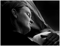
| 04/24/2006 11:16:32 PM |
Bondby ergoComment: I think it's just a little too dark. |
| Photographer found comment helpful. |
| 04/22/2006 02:00:18 PM |
|
| Photographer found comment helpful. |
| 04/22/2006 01:57:37 PM |
|
| Photographer found comment helpful. |
Home -
Challenges -
Community -
League -
Photos -
Cameras -
Lenses -
Learn -
Help -
Terms of Use -
Privacy -
Top ^
DPChallenge, and website content and design, Copyright © 2001-2025 Challenging Technologies, LLC.
All digital photo copyrights belong to the photographers and may not be used without permission.
Current Server Time: 03/12/2025 02:26:03 AM EDT.