| Image |
Comment |
| 03/06/2003 11:33:14 PM |
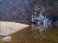
Winter Reflectionsby NitenComment: Really beautiful shot!
This is definitely one of the best at meeting the challenge! |
 Photographer found comment helpful. Photographer found comment helpful. |
| 03/06/2003 11:31:12 PM |
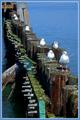
SEVENby GotchyaComment: Nice shot...fun idea. Some of the more literal in this contest might suggest that there is a lack of the linear in this but I would definitely disagree. I like the subtlety and love the colors! |
| Photographer found comment helpful. |
| 03/06/2003 11:28:43 PM |
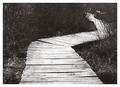
Walk This Wayby greenem2Comment: Interesting idea...I think it would work better for this topic if the path ended more in the middle of the shot. This format draws your eye into and through and out of your shot instead of leading your eye into a subject. I like the black and white but think it would be better with more contrast. |
| Photographer found comment helpful. |
| 03/05/2003 10:29:53 AM |
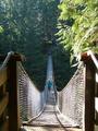
Lynn Canyon Suspension Bridgeby JakComment: Nice shot! I'd like it better if the lighting was more similar on the two sides where you can see the cable but it's difficult when you are working with natural light sources! Focus could be better but it's a great subject and an interesting idea. I might crop out some of the trees at the top to place subject more in the center of the shot. |
| Photographer found comment helpful. |
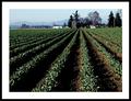
| 03/05/2003 10:24:43 AM |
Rowsby robbiehComment: Definitely one of my favorites in this challenge! Very well thought out shot...10! |
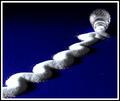
| 03/05/2003 10:20:52 AM |
Salt Shakerby JackoComment: Really fun idea...very creative! I like the color, shapes, texture, good lighting, nice focus... all around great photograph! 10 |
| Photographer found comment helpful. |
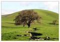
| 03/05/2003 10:19:31 AM |
Primary Oak by TarbiniComment: This is my favorite in this challenge! 10 ... The only thing that would make this photo greater is a more saturated sky blue color. |
| Photographer found comment helpful. |
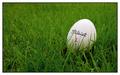
| 03/04/2003 12:07:25 PM |
In The Roughby jimmythefishComment: really fun idea and very well done although I think that those two blades of grass that go over "Titleist" should have been removed...they're a bit distracting! Nice light and I like the cropping. |
| Photographer found comment helpful. |
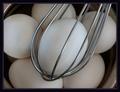
| 03/04/2003 12:05:03 PM |
Not Whipped Yetby jaygComment: I love your idea...I like the way the whisk compliments the form of the egg with similar curves and shape. |
| Photographer found comment helpful. |
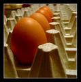
| 03/04/2003 12:02:29 PM |
Fo(u)r lonely eggsby micrixComment: I like this idea a lot but think you could have shown the idea of "lonely" better with just one egg! Interesting use of repetitive form and contrast! |
Home -
Challenges -
Community -
League -
Photos -
Cameras -
Lenses -
Learn -
Help -
Terms of Use -
Privacy -
Top ^
DPChallenge, and website content and design, Copyright © 2001-2025 Challenging Technologies, LLC.
All digital photo copyrights belong to the photographers and may not be used without permission.
Current Server Time: 03/12/2025 02:45:42 PM EDT.