| Image |
Comment |
| 10/26/2009 04:44:03 AM |
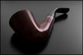
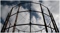
Leading Lines, Low Key, Rule of Thirdsby todbedyComment: Hmmm... A bit of a stretchy interpretation of the mentioned techniques. Not very low key. Not exactly leading lines as they normally should lead the viewers eye into the picture and/or to the main subject. Rule of thirds, well... Ok, but I rather call it centered composition...
But... Aside from that a well executed close-up, sharp, nice lighting. I only would have centered the object slightly more to the down-right. |
| 10/26/2009 04:33:33 AM |
|
 Photographer found comment helpful. Photographer found comment helpful. |
| 10/21/2009 10:38:51 AM |
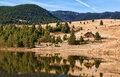
Serenityby linda12201Comment: Hmmmm, I don't know about this one. Composition is fine, exposure also, but there's something missing here. Maybe it's the reflection in the water that is not adding value to the pic (but that's a matter of taste I guess). Also the harsh daylight and therefore the strong shadows and contrast are not completely my cup of tea. |
| Photographer found comment helpful. |
| 10/21/2009 10:28:34 AM |
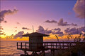
Tequilla Sunriseby TammsterComment: Very nice, lovely colors wich indeed reminded me of the movie. Maybe I would have tried to go a bit lower to get more perspective and depth into the cabin, to get a more dramatic feel. But overall: welldone! |
| Photographer found comment helpful. |
| 10/21/2009 10:24:39 AM |
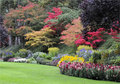
BUTCHART GARDENSby remboComment: The different autumn colors are beautifully presented in your image. I'm only not so sure about the composition. There is not much interesting to see in the foreground (grass) for instance. It could have been more appealing imho if you zoomed in on the foliage. Maybe a different point of view would also have worked better. |
| Photographer found comment helpful. |
| 10/21/2009 10:18:49 AM |
|
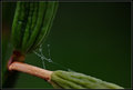
| 10/03/2009 06:51:33 AM |
Jeweledby bspurgeonComment: nice capture! It probably would have been even better with more symmtry and structure in the web. But then it probably wouldn't have met the challenge ;-). Welldone! 8 |
| Photographer found comment helpful. |
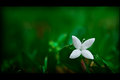
| 10/03/2009 06:48:53 AM |
x-flowerby klkitchensComment: Simple, tender and beatifully presented. I like the tonality of the green. 8 |
| Photographer found comment helpful. |
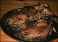
| 10/03/2009 06:45:51 AM |
This is mine - Yummmhhh.......by GlanniComment: I gave you a 1 for this. If your entry was meant as a joke, you probably won't be bothered by this score. Otherwise, these are my reasons for giving out such a low figure:
- the subject is not interesting and doesn't even meet the challenge to me, despite of the x formed toothpics in the eyes (which makes the scene even less attractive)
- the frontal flash gives it a candid-shot feel (but I presume that it was a candid, so you probably know this)
- You could have done more with the subject. Now, the only emotion you probably get from the viewer is disgust. If this was your intention, you succeeded. This doesn't mean that the subject itself couldn't be used in a more interesting, storytelling way. |
| 10/03/2009 06:30:37 AM |
X shapesby hajekaComment: Hello, I gave you a 4 on this one. I think, overall, the image is too messy and not appealing enough.
A few suggestions:
- B&W could have been an better option for this subject, which has to have it more from the structure and lines, then from color.
- A shallower DOF would have blurred out the background more. Now the seats and tables distract from the subject and the don't add any value.
- Emphasizing the symmetry of the subject could have made this image more appealing, for instance by leveling (the vertical pole straight and the center of the white squares horizontally aligned.
Off course: this is just the humble opinion of another amateur ;-)
Hope this helped a bit... |
| Photographer found comment helpful. |
Home -
Challenges -
Community -
League -
Photos -
Cameras -
Lenses -
Learn -
Help -
Terms of Use -
Privacy -
Top ^
DPChallenge, and website content and design, Copyright © 2001-2025 Challenging Technologies, LLC.
All digital photo copyrights belong to the photographers and may not be used without permission.
Current Server Time: 03/10/2025 06:17:20 PM EDT.