| Image |
Comment |
| 01/05/2007 01:45:13 PM |
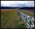
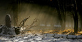
fEnCE - [tHe GraSS IsN'T aLWayS GReEneR]by surfinbirdComment: I love the look of the wood, so great timing to get the shot. However i feel it is too low in the image to give it the attention it deserves. It has so much potential for giving a great feeling to the shot and it's only in the lower half and you have so much empty sky above it. Position it a bit higher would fill the photo a bit more, without loosing the foggy, cold feel.
Personally i would also have placed the wood just a tiny bit more to the right so i could get a bit more depth feel by seeing the second post a bit better.
I love the atmosphere you captured, but i also feel you've lost some of its impact by not placing it a bit more prominent in the image. (vote=6) |
 Photographer found comment helpful. Photographer found comment helpful. |
| 01/05/2007 01:39:39 PM |
Country Fenceby sallyjo1Comment: Strongly oriented towards a central composition. I would have loved to have seen a thirds-composition of this, because i think it would have been better. The white fence takes you from the right corner to the middle and glides you out of it towards the left. So you miss the whole right side, next to the fence. I think placing the tower at a thirds to the right and thus letting the fence guide you through the image would have been better.
The choice to put the horizon line at a thirds is a good one in my opinion, because it gets the attention more to the fence, which can thus lead you through the image (vote=5) |
| Photographer found comment helpful. |
| 01/05/2007 01:35:44 PM |
Through the First Snowby elizadebComment: To me, the fence is too flat meaning it runs right along the horizon line and thus makes up its own plane in the photo, however there are no elements to lead you more in to the photo. The fence leads you from one side to another. I do see you have captured the bent, but it's hidden behind the flat part in front, so you're not guided inwards. I miss the depth, that i think you could have gotten by taking a more sideways approach to the fence.
I do like your choice of coloring, it fits with this image.
Vote = 5 |
| Photographer found comment helpful. |
| 01/05/2007 01:32:06 PM |
Overgrownby SJCarterComment: A good idea but by placing the fence-wood so low in your image it looses some of its impact. If you aimed a bit lower the bottom wire would get a bit more breathing room and the wood would reach a bit further along the strong line of thirds and as such attract more attention. (vote=6) |
| Photographer found comment helpful. |
| 01/05/2007 01:26:55 PM |
A fence to follow...by Ian-AndrewComment: Very strong. It seems a small part in the shot but because of the excellent use of the light, it is the one thing (the fence) that attracts the attention and guides you into the photo, towards the tree. Excellent! |
| Photographer found comment helpful. |
| 01/05/2007 01:23:59 PM |
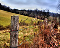
Fenced to Perfectionby denileighComment: I see the sun falling on the fence a bit further ahead. However in the biggest, closest part (left side of the photo) i don't see it. I miss the reddish warm influence on this part. Now i see the blue shadow the most and just a bit of sunlight behind it.. feels like i'm missing out on the nicest part. (vote = 5)
Also if you moved to the brighter part, you probably would have gained some shutterspeed, which would have helped you in avoiding the burned out sky. |
| Photographer found comment helpful. |
| 01/05/2007 01:17:43 PM |
A Test Of Timeby meowComment: As i can see on this shot, the sharp part is just before the red berries. It would have been a nice point of interest, which would brighten up the fence if it was in focus, but it isn't. The brown, rusted fence against the red fresh berries would have been a contrast that would have made this image a lot stronger in my opinion. Now my vote is 5 because of the, in my eyes, missed potential in this shot. |
| Photographer found comment helpful. |
| 01/04/2007 12:18:07 PM |
sunbathingby jmooreComment: I like how you took this shot against the light up, so you see the light outlines more than the actual structure of the wood. This helps in keeping the trees on the right to be secondary viewing point and bring the attention to the branches to the left. They are lighter and different from the rest of the shot. However i would have cropped it a bit more on the left because that cut of piece of the tree attracts more attention than it should in my opinion. It actually detracts from the branches. Removing it would help bring out the branches more and also leave more space for the beautifully captured light. (score = 7) |
| Photographer found comment helpful. |
| 01/03/2007 05:32:28 PM |
|
| Photographer found comment helpful. |
| 01/03/2007 11:47:30 AM |
|
Home -
Challenges -
Community -
League -
Photos -
Cameras -
Lenses -
Learn -
Help -
Terms of Use -
Privacy -
Top ^
DPChallenge, and website content and design, Copyright © 2001-2025 Challenging Technologies, LLC.
All digital photo copyrights belong to the photographers and may not be used without permission.
Current Server Time: 03/12/2025 06:56:49 PM EDT.


![fEnCE - [tHe GraSS IsN'T aLWayS GReEneR]](https://images.dpchallenge.com/images_challenge/0-999/609/120/Copyrighted_Image_Reuse_Prohibited_445762.jpg)