| Image |
Comment |
| 07/30/2011 11:57:29 AM |
|
| 07/30/2011 11:57:27 AM |
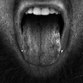
tasteby Eagle40Fox2Comment: NO redeeming characteristics... simply a gross photo |
 Photographer found comment helpful. Photographer found comment helpful. |
| 07/30/2011 11:57:02 AM |
tickle me.....by danieletagliabueComment: How is this a "nice" or flattering picture of this lady? Foot is bigger than the subject. Also dead centered foot in composition and deep shadows in water are distracting. What's that distracting item at top right corner of photo? No detail (too much shadow) on woman's face. I just don't like the idea, the composition, lighting or anything about it... sorry it just turned me off. |
| 07/30/2011 11:54:32 AM |
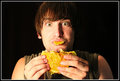
Just One Bite?by StillZachComment: Lighting is too harsh, composition is too dead centered (review rule of thirds) and not enough detail in shadows on subjects left side especially in the hair which disappears into the dark background. The food in the mouth is a little distasteful. The idea of the photo is just gross to me... sorry. |
| 07/30/2011 11:52:35 AM |
Flavor Overloadby byetkoComment: Cute baby but flat lighting and no light in the eyes with no catch lights and dark circles under eyes and black cavern in the mouth ruin the idea. |
| Photographer found comment helpful. |
| 07/30/2011 11:52:32 AM |
Eyesby AomarComment: Emphasis put on the bad tooth (or discolored gum around tooth) and skin... rather gimicky, thumb so out of focus is distracting. I just don't see the point. |
| 07/30/2011 11:51:20 AM |
Sense of Touch by jagarComment: How does grabbing her butt add to the image? I took off 5 points for that, otherwise the black and white was pretty good other than the subjects being dead centered in the photo (review rule of thirds). The pattern in the tile could have been used to create an interesting diagonal leading line if camera had moved to left which would have also given a less bright background at the top. |
| Photographer found comment helpful. |
| 07/30/2011 11:49:27 AM |
Hear that?? It's the sound of the morning melody =D by GYPComment: Looks like a snapshot... photo doesn't say anything, maybe the "notes" across the background should be strung to look like they are coming out of the radio? Christmas coffee cup and shorts and sunglasses don't jive. Pay more attention to detail... what's that glob of black stuff on ground at leg of table. Lighting is too harsh and washes out the detail in the shoe and leg of subject. Crop out a couple inches at top to get rid of the "too bright" background. |
| Photographer found comment helpful. |
| 07/30/2011 11:46:42 AM |
Scent of a roseby marvinComment: Wouldn't expect to see a rose against a stark white background... all the white pulls the eye away from the flower and the water looks fake. However good composition, focus and color make it better than an average flower photo. |
| Photographer found comment helpful. |
| 07/30/2011 11:46:03 AM |
|
| Photographer found comment helpful. |
Home -
Challenges -
Community -
League -
Photos -
Cameras -
Lenses -
Learn -
Help -
Terms of Use -
Privacy -
Top ^
DPChallenge, and website content and design, Copyright © 2001-2025 Challenging Technologies, LLC.
All digital photo copyrights belong to the photographers and may not be used without permission.
Current Server Time: 03/10/2025 08:58:14 PM EDT.