| Image |
Comment |
| 05/08/2008 09:31:20 AM |
Baby Racoonby kashiComment: I like the use of the V in the tree. I find the fringing on the twig to be distracting. |
 Photographer found comment helpful. Photographer found comment helpful. |
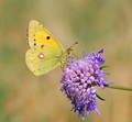
| 05/08/2008 09:29:45 AM |
Odd triangleby GabrielSComment: Nice image and nice and sharp. I would have cropped the top and right tighter. |
| Photographer found comment helpful. |
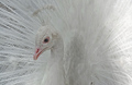
| 05/07/2008 09:08:31 PM |
White and Glorious by JunieMoonComment: Overall, the bird is in a nice pose. However, I find at least 3 problems with the image: 1) the bird's neck/head is underexposed, 2) the far right brightness distracts from bird, and 3) the right third or so of the image isn't interesting. Cropping out the right part of the image would solve 2 and 3 and enhance the image. |
| Photographer found comment helpful. |
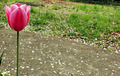
| 05/07/2008 09:08:25 PM |
...Lonesome...by AlexgioComment: The tulip is very nicely lit. However, I think the background is too distracting and takes up too much of the image. Also, the leaf intruding from the left is distracting. (Perhaps you could have simply held it out of the way during the exposure.) |
| Photographer found comment helpful. |
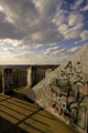
| 05/07/2008 09:08:17 PM |
Elk Mound turret by undieyatchComment: Nice dramatic sky. However, I don't think the image works. The real center of interest should be the graffiti in the triangle, but my eye is drawn to the railing as well as the sky. Maybe if you had gotten down lower and shifted to the left to eliminate the railing. |
| 05/07/2008 09:08:12 PM |
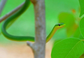
Snake Chimeby sparrowsdeathComment: Nice colors and exposure. I find the out-of-focus stick very distracting and feel it cuts the snake (especially with the right being in focus and the left out of focus). |
| Photographer found comment helpful. |
| 05/07/2008 09:07:56 PM |
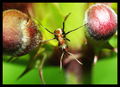
in the middleby andrijaComment: Interesting image and very interesting use of triangles. However, I don't really like the centering of the ant and I would prefer to not have the left berry so out of focus. |
| 05/07/2008 09:07:45 PM |
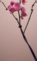
Pink Orchidby treborsonComment: Very nice colors. I think the bottom is a bit empty and I find the cutoff orchid at the top distracting and would have preferred to see it all. |
| 05/07/2008 09:07:41 PM |
Holy Nightby JuliBocComment: Very effective lighting. I would have preferred not having the "SCIENTIST" as it distracts from the steeple. (I realize it was not possible to eliminate this in basic editing.) I think the tilting works well. |
| Photographer found comment helpful. |
| 05/07/2008 09:07:35 PM |
xby mb2006Comment: Excellent image. Very graphical and great use of the multiple triangles. I think cropping the top to eliminate the rings makes it somewhat stronger as they are a bit distracting. |
| Photographer found comment helpful. |
Home -
Challenges -
Community -
League -
Photos -
Cameras -
Lenses -
Learn -
Help -
Terms of Use -
Privacy -
Top ^
DPChallenge, and website content and design, Copyright © 2001-2025 Challenging Technologies, LLC.
All digital photo copyrights belong to the photographers and may not be used without permission.
Current Server Time: 03/10/2025 10:36:45 PM EDT.