| Image |
Comment |
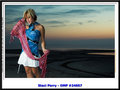
| 09/01/2006 01:52:22 AM |
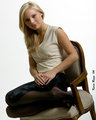
0175 - Sexy Loungingby KevinRiggsComment: Originally posted by dleach:
The angle seems odd |
Grantcha that one. The angle is intentional but moreso from necessity than from artistic purpose on this one. Ashley is a petite, Southern, little lady. The chair we used is actually designed for a child so that the legs are short, and by "short" I mean, what you see in the pic is just about all there is to them. She fit in the seat just fine but I didn't have much at all to work with, hence the angle. I hope to have a few corner chairs before too long and the angle issue will be moot but for right now its pretty much a necessity.
Thanks for the comments, tho. Your point is well-made. I'll have to consider how to shoot something like this next time if I have such a situation occur again. |
| 09/01/2006 01:46:09 AM |
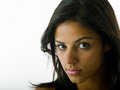
0175 - Sexy Loungingby KevinRiggsComment: Originally posted by CalliopeKel:
How do you get your white backgrounds so white and clean looking? |
Seriously? OK, here's my secret . . . I bleach them between shoots.
Honestly its just the lighting and then PP. I wish I was meticulous enough to measure each time so I could tell you something magical like "its 1.5 or 2 stops just whichever side of the key on the subject" but I don't. I really do eyeball the background in most of my compositions and then adjust the rest of the lights accordingly. Its not the smartest or sexiest way to do it; I wish I used the darned light meter so that I could reproduce my results but easily half the time I test my setup before the model arrives by shooting into the white paper background and then adjusting the background lights to the level I want them and once the subject arrives I reset the foreground lights to achieve the effect I want.
Originally posted by CalliopeKel:
When can you come to Knoxville and help me with my new studio? |
Fer real? I have some people I'd love to shoot with up in Knoxville and I'm already coming up for some ballgames this fall; maybe we should talk. You realize, of course, you don't honestly want to learn any bad habits from me but I'd love shooting with you. |
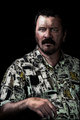
| 09/01/2006 01:37:43 AM |
0621by KevinRiggsComment: ROFLMAO (sorry I invoked you, Art)
And here I expected to get gig'd for something else.
I can't begin to explain how I need a MUA/hairstylist that can come over and help concoct something aligned to my "vision" but then again, I'm afraid the poor soul would simply croak if asked to understand or predict what I think I see.
;) |
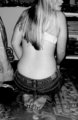
| 08/30/2006 07:47:34 PM |
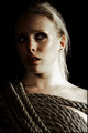
rope1v2.jpgby JewellianComment: I love the smaller thumbnail but the larger version seems a little unclear in its point of interest. The lines work for me in the smaller version mainly, I think, because I can't perceive the shallow depth of field. With just a little more DoF and maybe a curves adjustment to lighten this up its a strong image that I'd like better (I think). Its a very interesting subject and composition (I clicked it even though its the last in the list of images you showed). |
 Photographer found comment helpful. Photographer found comment helpful. |
| 08/30/2006 07:43:20 PM |
Alexa.jpgby kevrobertsonComment: Yeah, it doesn't work in basic; I'm with ya on that one. The light on the rope is super, tho. Just too much on the subject. I think the original light on the rope would be cool and I'd love to see a slightly softer light on the model with a blue gel to give her a cool feeling. |
| Photographer found comment helpful. |
| 08/25/2006 10:56:20 PM |
IMG_8671-01.jpgby dwterryComment: Right off the bat I felt like I didn't much like this one but when I started looking around it to figure out why I realized that I was really just finding personal nits as the shot looks good. Nice composition, nice setting, good lighting, interesting pose & outfit. |
| Photographer found comment helpful. |
| 08/25/2006 10:52:55 PM |
IMG_8744-01.jpgby dwterryComment: I like the lighting in this; its complimentary to the model. The colors in the scarf work well against the shirt as the shirt seems to bring out the blue in the dusk behind the model. My favorite so far. |
| Photographer found comment helpful. |
| 08/25/2006 06:36:57 AM |
Jeffby SDWComment: The processing looks cartoonish on the skin but I love the effects on the patterns in the shirt. Perhaps softening the effect on the skin through layer masks might allow you to keep the effect but with less of an impact on the skin. Looks like a very good portrait. |
| Photographer found comment helpful. |
| 08/23/2006 09:23:46 PM |
Jeansby Blue MoonComment: Love the texture in the jeans. I'm working on a bluejeans study (well, it started as backs & bluejeans but its kinda progressed). The background is a little cluttered for the style I'm working on but this works as more of a 70's throwback (the magazines by the right shoulder remind me of vinyl album covers, hence the decade). |
| Photographer found comment helpful. |
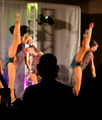
| 08/14/2006 12:46:41 AM |
|
| Photographer found comment helpful. |
Home -
Challenges -
Community -
League -
Photos -
Cameras -
Lenses -
Learn -
Help -
Terms of Use -
Privacy -
Top ^
DPChallenge, and website content and design, Copyright © 2001-2025 Challenging Technologies, LLC.
All digital photo copyrights belong to the photographers and may not be used without permission.
Current Server Time: 04/02/2025 06:53:06 PM EDT.