|
|
|
Showing 121 - 130 of ~1843 |
| Image |
Comment |
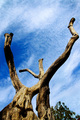
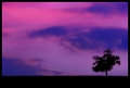
| 09/20/2006 08:43:03 PM | Reaching upby RefwhettComment: Greetings from the Critique Club. My critiques are generally geared towards trying to help you improve your score within DPC, and not on any true "artistic" merit of the photograph itself, unless it relates to DPC voters and scoring. Please keep that in mind as you read this.
Initial Thoughts
Nice angle, cool tree.. but doesn't really speak much to me.
Composition/Content
Compositionally, you have some good things, and some not so good things.
Good things:
- The flow of the tree works well with the flow of the clouds.. giving the shot some energy.
- Seems to be well balanced, except for the bottom of the frame.
Not so good things:
- The bottom of the frame is crowded and unbalanced. The top of the other tree sort of balances things out, but works against the photo both challenge-wise a bit, and because it just seems out of place.
As for content, it's a good dead tree with a bit of interest, but really not enough to hold a viewer/voters' attention for long. It doesn't really have much of a *presence*.. doesn't resemble anything that might make someone take notice.. anything like that. It's just kind of.. there. While this is never a truly terrible thing if you find some connection for yourself.. on DPC it generally averages out to poorer scoring.
Background
You've done some great work on the sky, and as I said, the clouds really work with the flow of the tree.. that's my favorite part about this photo.
Camera Work/Technical
Good focus. There seems to be a bit of lens artifacting or camera-shake type stuff in the lower right. Good work with a sunny day though.
Digital Processing
As one person said, the contrast on this is a little too strong. You've lost detail in a lot of the shadows.. basically blacking them right out. The highlights/whites are good, but those darks are just too dark. The work on the sky is nice. A good blue, not too too strong, and not that cyan-y look that puts many people off. There's not much I can recommend here.. as it's not really processing that hurt this shot so much (besides contrast)
Fits the Challenge
Fits, although there's a question about that other tree-top.. but that's minor in every way and I can only imagine the most picky voters would have docked you for that.
My Opinion of the Photo
This is something I'd probably take myself.. and one of those instances of seeing something with your eyes that totally loses itself in the translation to photography. I have 100s of like-photos, and sometimes I wish I could capture what I see a lot better. You've done a nice job, but not a fantastic job.. but I don't think I can personally condemn it. Keep shooting away, and if you ever find that elusive way to capture *exactly* what we see... let me know about it eh?
Good luck in future challenges. |  Photographer found comment helpful. Photographer found comment helpful. |
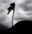
| 09/19/2006 11:29:50 PM | Enduranceby BalkoComment: Quite a nice moody.. isolationistic desolate shot. Could be a little sharper for me, really.. but the mood is conveyed very well. | | Photographer found comment helpful. |
| 09/19/2006 11:28:19 PM | | | Photographer found comment helpful. |
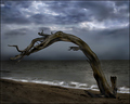
| 09/19/2006 09:34:44 PM | Bent But Not Broken by jrjrComment: I would have liked this photo so much better had some original texture been left in it :/
This is definitely a "Right place at the right time" ribbon win. We all need a few of those. Hold on to it dearly.. but my advice? Give us some texture next time :)
|
| 09/19/2006 09:33:00 PM | Day's Endby SJCarterComment: Not entirely sure how Elsapo's image gets blue.. and you end up 109th...
:/
Especially with that travesty of a red ribbon there.. The "neat image to look like vaseline" is in again I guess.
| | Photographer found comment helpful. |
| 09/19/2006 09:04:14 PM | Butterflies & Flowersby rileyComment: Greetings from the Critique Club. My critiques are generally geared towards trying to help you improve your score within DPC, and not on any true "artistic" merit of the photograph itself, unless it relates to DPC voters and scoring. Please keep that in mind as you read this.
Initial Thoughts
A nice shot, but something doesn't feel right.. missing that edge.
Composition/Content
For me, the composition feels a little too crowded into the corner here. Some more negative space would have really helped, especially to sell the "flower" portion of your title. Everything just seems so crowded into that one little space, and the negative space you *do* have doesn't really play well with that.. making it only seem more so, instead of isolating the subject as it should. As I said, leaving more room around the butterfly would have helped this particular photo out a lot.. in my mind.
Background
A good OOF background, but the green color is a little too flat and works against the colors of the flower and the butterfly. There is a lot of clashing going on there.
Camera Work/Technical
Good DOF, but I see a lot of camera shake. I'm curious as to what focal length you were at here, and assume you were getting between 200-300mm? At 1/320, you would have wanted to be somwhere around 150mm.. any more than that and you risk what happened here, unless on a tripod. IS might have helped, but if you were using it, it didn't show up well here, or maybe even hindered this photo.
Digital Processing
This image, IMO, is far too "flat" an image for a really good score on DPC. Camera shake aside (which probably also caused a few lower votes), the color really clashes here, but not in a good way.. in a way that produces any pop. You are left with an image that looks very 2-dimensional, even with a shallower DOF. Some boosts in Contrast, a little more work with a Selective Color adjustment to get some stronger, deeper color, and perhaps getting that background out of that flat pea green color would have all helped. DPC really requires you to have something extra .. intense.. to place really high. Colors that work well together, sharp, sharp images, and moody contrasty images. What I see here is almost the opposite of that. While it is still a decent photograph for what it is, it simply lacks that DPC-ness it needs.
Fits the Challenge
I don't have any personal connection to flowers *or* butterflies as "pleasures", really.. but anything that promotes a sense of calm and peacefulness can't be all bad, and I'm sure you resonated well with many voters.
My Opinion of the Photo
Nothing particularly engaging here for me. Butterflies on flowers shots are a dime a dozen, and they require something really special to shine on a website where we are bombarded with a dozen such photos a day.. Doesn't mean we should stop trying, however, and this is a good step toward the end DPC purpose. | | Photographer found comment helpful. |
| 09/18/2006 10:56:31 PM | Quiet Timeby EssAreDubyaComment: Greetings from the Critique Club. My critiques are generally geared towards trying to help you improve your score within DPC, and not on any true "artistic" merit of the photograph itself, unless it relates to DPC voters and scoring. Please keep that in mind as you read this.
Initial Thoughts
Definitely simple, but I think you have to be a dog lover...
Composition/Content
Compositionally, this could have been a lot better. Generally, shots with the subject in the middle of the frame, in a no-nonsense simplistic, flat approach, tend to do quite poorly. DPCers *love* people that bend the bar and try and find new approaches, angles, viewpoints, etc.. without going *too* overboard.. but you definitely need to find something a little more pleasing and dynamic. Some examples:
Getting down on your stomach and finding the dog's level. Use DOF to your advantage.
From above more. Get a step ladder and lean over. Try and find some creative way to show a view that most seldom see.
Tilt the camera - Again, try and use DOF to your advantage and make the shot less flat.
Just a few examples where a touch of creative thinking can go a long way. Sometimes simple is good, but it should be simple and *creative*.
Background
The color is pleasing, and you can really feel the texture.. it *wants* to work, but because of the flatness of the photo, it just doesn't.
Camera Work/Technical
Your settings tell me that you probably, more or less, just saw the subject, grabbed the camera, and took a photo on the spot. (Using a smaller aperature to get everything in focus.). Not a bad idea sometimes, but as I mentioned above, you really want to put the tools you have at your disposal to work. Remember.. creative. Play around. Get different. As far as technicals go though, I really have nothing to say. Nothing is glaringly wrong, except for maybe a slight over-exposure, but since you auto-leveled, that might not have been in-camera.
Digital Processing
Some things:
- You're lacking a little bit of sharpness. You might want to play around with USM (unsharp mask) to boost this a touch more on future entries.
- For me, this is a little over-exposed. I think you were a little bit too strong on the brightness and contrast sliders, as you should really never go above a +9 or +10 if you have a good exposure from your camera. You've clipped a little bit of the highlights here, which detract some from the over-all photo.
Other than that, everything looks good for what you've done. One hint.. if a photo seems a little flat, one thing to do if boosting contrast is clipping your whites, is to use "Selective Color" and give the black slider in the Black channel a bit of a boost (generally +2 - +5). This will keep your highlights even, but give you the dark boost that can bring out a shot from being a little too flat. Of course, if the shot is flat-ish because of angle and composition.. not much post-processing will save it.
Fits the Challenge
This is where this photo shines, as it really *is* a simple pleasure. A nap in a comfortable place.. oblivious to life. Yah.. that's bliss.
Had you captured that mood in a more creative way, we'd be talking a much, much higher score.
My Opinion of the Photo
While a strong connection to the challenge, it fails to really speak to the viewer (beyond a few people that have a strong connection to cute things). It's presented in a very flat and uninspiring manner, and my first instinct is to click "next".
Keep working on finding new ways to shoot.. on creativity, and I can guarantee that you'll see your scores start to rise. The main thing here is to have fun, and learn as you go. Good luck on future challenges. | | Photographer found comment helpful. |
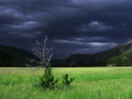
| 09/18/2006 10:34:25 PM | A dark cloud eyeing a dry treeby snowleopard10101Comment: Greetings from the Critique Club. My critiques are generally geared towards trying to help you improve your score within DPC, and not on any true "artistic" merit of the photograph itself, unless it relates to DPC voters and scoring. Please keep that in mind as you read this.
Initial Thoughts
Some good, dark energy here, but beyond the background, I'm left wanting.
Composition/Content
A good use of an off-centered subject, giving us some open area, and allowing us to find the tree, follow it upwards, and lose ourselves in the ominous background clouds. One of the points that I find detracts, however, *is* the ominous background. It grabs all of my attention, leaving nothing for the tree. However, it's obvious that the way I look at it isn't how DPC looks at it, so you've done something right as far as voters go that I, myself, have missed. I guess what I'm trying to say is.. I have nothing to offer in terms of DPC-ness, as you've obviously got the dark and moody thing down pat, and that really sells right now.
Background
The selling point of this photo, IMO. Good work on it, and a good grab with the contrast of the foreground light.
Camera Work/Technical
A little bit off-focus to my eyes.. or soft.. somehow. It's missing that real sharpness that most high high placing landscapes have here. With that in place, I believe you might have jumped into the top-10. (That, and a little more processing.. which I'll touch on..)
Digital Processing
See? I said I'd touch on it. :) Anyway, What I feel is missing in this photo that a top-10 photo would have needed is a lot stronger "grunge" processing.. of a sort. Something that would have contrasted the tree and foreground even more-so from the dark clouds. Lessening that brightish green into something a little less saturate, but more stand-outish. Definetly more work with sharpen. Creative work on the dry, dead tree to really get it to stand out and be a little more "3D" looking. Of course, it's easy to *say* these things, and I'm not particuarily good at landscapes myself, but knowing what places high.. I know that it needed just a little more.. to really break that line and get you on the front page.. or at least in the top 10.
Fits the Challenge
It's a nice representation of the Rule of Thirds, nothing horribly askew, and it doesn't make me want to get my Ruler out ;)
My Opinion of the Photo
While I can see that DPC voters obviously liked this shot a lot, I personally don't have much connection with it. It seems to be fighting between wanting to be desolate, and wanting to be full of life.. I can't tell which one I'd rather it be, and the color, especially the green, isn't very appealing. It's a *good* photo, and shows some fine technical ability, but on an emotional scale, for me, it just isn't there.
Congratulations on a high top 20 though, and good luck on future challenges. | | Photographer found comment helpful. |
| 09/13/2006 09:51:42 PM | Deep breath of country air.by parrotheadComment: You finally got her that ribbon, and I am so proud of you.
I have tears in my eyes.
You and Gracie deserve this more than I can put in words.. Wonderful job, great timing, and kudos for sticking with it through everything. You're a true inspiration. | | Photographer found comment helpful. |
| 09/07/2006 09:59:01 PM | Day 1 - The Hat is Backby JutildaComment: Loving your work. Simple and classic, but with strong moods, themes, and energy.
I'll be sure to look every day, keep them coming. | | Photographer found comment helpful. |
|
Showing 121 - 130 of ~1843 |
Home -
Challenges -
Community -
League -
Photos -
Cameras -
Lenses -
Learn -
Help -
Terms of Use -
Privacy -
Top ^
DPChallenge, and website content and design, Copyright © 2001-2025 Challenging Technologies, LLC.
All digital photo copyrights belong to the photographers and may not be used without permission.
Current Server Time: 04/18/2025 08:07:27 PM EDT.
|