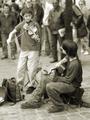
DPChallenge: A Digital Photography Contest You are not logged in. (log in or register
 
Browse Settings
Currently viewing:
Registered UserTooCool

Show comments:

Per page:

Order:

Comments:


Comments Made by TooCool
Pages:   ... [387] [388] [389] [390] [391] [392] [393] ... [399]
Showing 3891 - 3900 of ~3982
Image Comment
thinking outside of the tank
09/10/2003 11:04:33 PM
thinking outside of the tank
by artizen

Comment:
Just added this shot to my favorites. Love the originality. And a first time submission! Nicely done!
Photographer found comment helpful.
Honey! I can explain!!!
09/10/2003 03:31:44 AM
Honey! I can explain!!!2nd Place
by kosmikkreeper

Comment:
'Cool ya got a ribbon!!! Great shot!
The Morning After
09/10/2003 03:24:53 AM
The Morning After3rd Place
by GolferDDS

Comment:
'Cool for you....Ya got a ribbon!!!

Hopefully the first of many!
TC
Photographer found comment helpful.
Damn pothole!
09/10/2003 03:21:38 AM
Damn pothole!
by TooCool

Comment:
I am like TOTALLY blown away that I got 7th place here. I was shooting for the top half. Thank you to EVERYONE who commented. It's cool to know others like what ya do!
Thank You , Doctor.
09/10/2003 02:49:21 AM
Thank You , Doctor.
by faidoi

Comment:
Faidoi, to make this pic POP for me it needed a little bit sharper focus. I did have a hard time with fitting it into the oops challenge. Like someone else said it was more like after the oops but definately better than broken eggs :-)

I gave you a six!

Photographer found comment helpful.
Smooth Sailing
09/10/2003 02:35:15 AM
Smooth Sailing
by mariomel

Comment:
Very pretty shot. Love the whole blue feeling here. Nice and calm and serene. Great mood.

Only things I would change: The focus seems (very) slightly off on the boat. I would like to see it a touch sharper. I know it's hard to do with a low light subject like this.

Also, I would like to see either a. more detail in the boat (don't know if it's possible in this lighting) or b. less detail in the boat (true silhouette).

Oh and (just a personal thing) I hate the border that isn't really a border. Don't understand it.

Scoring (as usual for the POD there is no topic to skew the score so...) I would give this an eight (leaning toward nine)

Hope it's helpful.
TC
Photographer found comment helpful.
thinking outside of the tank
09/07/2003 12:38:15 AM
thinking outside of the tank
by artizen

Comment:
A little fill flash, a little more dof and this woulda been the best shot here. Love the comic book feel of it but it just doesn't quite hit it. One of my favorites of this challenge though! Very BRAVE AND ORIGINAL!!!
Photographer found comment helpful.
angels touch
09/07/2003 12:26:03 AM
angels touch
by cody82290

Comment:
too small. Too soft focus. Too dark. No oops.
As the Egg Fell, it's Whole Life Flahed Before it's Eyes
09/06/2003 01:24:18 PM
Covent Garden Buskers
09/06/2003 12:48:45 AM
Covent Garden Buskers
by floyd

Comment:
This is a very cool shot. DOF is very good for this set up. In fact it reminds me how I need to get a camera where I have more control over that aspect. The bacground is just enough out of focus to keep your eye on the subjects.

I also love that there is enough detail to keep your eye without being 'noisy' in a compositional sense. The lines are very good at helping to direct the eye also. I find that I move around this picture but keep coming back to the same place. The fiddle players instrument points at the instrument of the seated individual. The seated player's left leg points at the fiddle players bow. This brings you back to the fiddle players face which is pointing at the seated players face. Then my eye goes down the seated players arm around to his hand and back to the fiddle which brings me again to the fiddle players face! I LOVE the implied interaction between the two subjects because of the eye contact that you can't really see but know is there!!!

Compositionaly I first thought of croping farther to the left to bring in the case where presumably people are throwing in money. Then I realized that with the background and setting you really didn't need to see that element.

Normally I will harp about taking away color. I LOVE color. However with this shot you get much more feeling (warm fuzzy...) with the use of the sepia toning (which in this instance does not 'age' the picture so much as it sometimes can!)

I personally might have sharpened up the subjects a touch, but I am not sure this would have improved the shot or not.

If voting (without a theme to change the vote) I would give this at LEAST an 8 probably a 9!

Keep up the good work, hope I didn't ramble on too long...
TC
Photographer found comment helpful.
Pages:   ... [387] [388] [389] [390] [391] [392] [393] ... [399]
Showing 3891 - 3900 of ~3982


Home - Challenges - Community - League - Photos - Cameras - Lenses - Learn - Help - Terms of Use - Privacy - Top ^
DPChallenge, and website content and design, Copyright © 2001-2025 Challenging Technologies, LLC.
All digital photo copyrights belong to the photographers and may not be used without permission.
Current Server Time: 04/11/2025 11:45:43 AM EDT.