| Author | Thread |
|
|
03/28/2012 06:54:29 AM · #1 |
Half way through the voting in Glasses II, I found the DPC tutorial on tone mapping and thought I�d give it a try. I used my entry to try it out. Here are both versions.
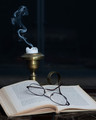 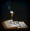
I can�t help thinking how much better the second one would have done.
|
|
|
|
03/28/2012 06:58:45 AM · #2 |
| whoa... beautifully done! I forgot to vote on this one, but it certainly would have been at least a one point difference in my vote. |
|
|
|
03/28/2012 07:21:04 AM · #3 |
|
|
|
03/28/2012 07:21:04 AM · #4 |
| I really liked this picture the first time I saw it. It does look even better with the tone mapping. |
|
|
|
03/28/2012 07:25:11 AM · #5 |
| The 2nd one is much more expressive. Very nice tones! I think I'll be looking at this tutorial : ) |
|
|
|
03/28/2012 07:33:35 AM · #6 |
Originally posted by Marty:
Even without a squirrel? |
The tones were so lovely, I forgot there was no squirrel!
-3 points for that oversight...
Seriously, though. You did that beautifully. I'd consider rewriting the tutorial. I had seen that tutorial before and ignored it (unfortunately) because I didn't care for their example.
|
|
|
|
03/28/2012 07:51:24 AM · #7 |
for me it's the difference from a 4 to a 6. I didn't vote but had I done so that's what it would have been.
|
|
|
|
03/28/2012 07:54:04 AM · #8 |
| Yes, the second one is much better. You didn't need tone mapping to get that image, just a different editing :) |
|
|
|
03/28/2012 07:56:02 AM · #9 |
|
|
|
03/28/2012 07:57:08 AM · #10 |
| gave 7, would give 8 or 9 |
|
|
|
03/28/2012 08:00:13 AM · #11 |
Originally posted by Dirt_Diver:
for me it's the difference from a 4 to a 6. I didn't vote but had I done so that's what it would have been. |
ON an image that finished close to 6 you would have voted it a 4? |
|
|
|
03/28/2012 08:08:45 AM · #12 |
| Gave a 7 and likely would have given an 8 or 9 on the new edit. |
|
|
|
03/28/2012 08:15:10 AM · #13 |
Originally posted by MattO:
ON an image that finished close to 6 you would have voted it a 4? |
i didn't vote this challenge but it wouldn't have scored more than a 5 from me. the original is very bland. good idea and setup, but it doesn't excite me. the second does a much better job of holding my excitement and encourages me to study the details, that one would have gotten a 6 or more based on the strength of the other entries.
Message edited by author 2012-03-28 08:16:43. |
|
|
|
03/28/2012 08:29:39 AM · #14 |
Originally posted by MattO:
Originally posted by Dirt_Diver:
for me it's the difference from a 4 to a 6. I didn't vote but had I done so that's what it would have been. |
ON an image that finished close to 6 you would have voted it a 4? |
I would have, and the reason is lighting, composition, and editing. For starters it looks like this was SOOTC (straight out of the camera). Not to mention that the lighting is not flattering in the image at all. Yeah it lights the subject okay but it's flat lighting and we can see things in the background which distract me from really focusing on the main subjects of the image. On top of that, it looks like his white balance is off, the image is crooked, the candle holder in general has a good position but the part you hold is away from the main section and below the book which gives the effect that it is not part of the candle holder anymore. It looks weird over there all by itself.
To add a little more critique to this image, the title in my eyes does and doesn't do the image justice. I can see where he is going but had there been a blur of a child in the bed sleeping in the background it would have made a world of difference.
For what it's worth  Marty, if I was shooting this same shot (as it stands now) I would have used 2 lights. One with a snoot to make the glasses and the book to stand out more and the other a few stops lower the main to illuminate the rest of the focus area but not enough that it spills onto the background. In general it would have given me a vignette which I wouldn't of needed to create in Photoshop like you did in your second edit. I would have also laid a black sheet or something dark under your subjects so we don't see the marble counter top. Marty, if I was shooting this same shot (as it stands now) I would have used 2 lights. One with a snoot to make the glasses and the book to stand out more and the other a few stops lower the main to illuminate the rest of the focus area but not enough that it spills onto the background. In general it would have given me a vignette which I wouldn't of needed to create in Photoshop like you did in your second edit. I would have also laid a black sheet or something dark under your subjects so we don't see the marble counter top.
Does that explain why I would have voted it a 4 MattO?
|
|
|
|
03/28/2012 08:47:44 AM · #15 |
Now that�s a critique. I�d love it if people would do that while voting.
The real lesson learned here is� Try new techniques on your next entry, not the last one. You�ll only be upset about the one that got away.
|
|
|
|
03/28/2012 09:07:14 AM · #16 |
Wow, that's a major difference! I gave the original a 6. While I did like it, it was just missing some "oomph", which the second photo definitely has! I would have given the newly processed shot at least a 7, if not an 8.
With the second photo, the smoke has a more blue-green appearance and pops off the black much better. The stray vertical lines are also less noticeable, which is part of why I gave the original photo a 6.
The pages in the second shot look more worn, older, which gives added interest to the shot overall.
I think the tone mapping would have been the way to go, should you have found out about it sooner. It is much "warmer" in appearance, and radiates a sense of "bed time" much better than the first.
I will definitely have a look at the tone mapping tutorial. :)
Thanks for sharing the comparison with us. :)
|
|
|
|
03/28/2012 09:44:40 AM · #17 |
| I gave you a 6, but with that color/tone it would have been a 7 or an 8. |
|
Home -
Challenges -
Community -
League -
Photos -
Cameras -
Lenses -
Learn -
Help -
Terms of Use -
Privacy -
Top ^
DPChallenge, and website content and design, Copyright © 2001-2025 Challenging Technologies, LLC.
All digital photo copyrights belong to the photographers and may not be used without permission.
Current Server Time: 03/10/2025 06:27:13 PM EDT.


