| Author | Thread |
|
|
01/07/2025 06:43:57 AM · #1 |
I have carried this discussion over from my entry to the forums because I thought it would be an interesting topic of discussion. Here is the response by Willem to my request:
Originally posted by GolferDDS said on 2025-01-06::
Originally posted by roz:
this is amazing ..
I hadn’t seen this challenge until Anita told me how yours should have got the blue ..
so of course I came to check it out ..
WOW .. brilliant result .. and I loved reading your backstory .. :)
feel sad about those low votes .. would love to know why .. :(
Thanks Roz And Anita,
Yes, I would love to hear from the low voters so I can learn how to improve my results in the future.
“I gave it a 4 for reasons already explained during the challenge. The flat light seems to be a trademark/style (on camera flash?). I noticed I often make that remark on your images. The images often lack shadow contrast in my view. If I look at the histogram it is often quite narrow. On my phone it looks better but on my calibrated screen the images look often really flat. This aspect often takes 1 or 2 points of my rating” Willem
Willem,
Thank you for your critique of my Food entry. I have found it informative and I am trying to learn how to improve the flatness of some of my entries. I see what your concern is. I used flash from the side and behind the main image but tried bouncing the light off the ceiling. I also opened the blinds to allow natural light on the subject but apparently was not successful. Interestingly enough both our images were basically the same creative concept ie. falling food. I always try to give myself a score when I submit a picture and compare it to the final result to see what the general opinion is. It is a way for me to get a sense of the reality of my expectations. I was wondering what score you would have given yourself on your entry?
Thanks again, Larry
|
|
|
|
01/07/2025 08:43:21 AM · #2 |
I also looked at the comments on your picture. It's a nice picture - but not an outstanding one. Willem is right to mention the flat lighting, the missind shadows and the cluttered background.
I myself was enthusiastic about the idea, but there would have been room for improvement in the realization. My vote was still a benevolent 8 |
|
|
|
01/07/2025 08:46:43 AM · #3 |
Looking back at my ratings in the food challenge I see some scores which I would have done differently if I had to redo them now. This includes raising your score slightly. I think I have been a bit harsh when compared to some of the standard snapshot type of images. It would not have made a difference to the end result.
I would have scored my own image a 7 or 8 which would be 4th or 5th in the challenge. I like how the movement blur turned out, I like the colors, but I also think it is a bit simple head-on scene and a bit of a gimmick. No match to some of those shots that made a dish really look delicious. But my personal challenge here was also to try this technique to create the feeling of movement, so no problem if anyone else also considers this a gimmick image. I do wonder why one would score this a 3 though. Was it the title? Or anything else?
Continuing the discussion about light and contrast: I personally like an image with a special type of light, for example backlight, side-light, good shadows etc. If I use a flash, I often put a large black cloth opposite the flash so the light does not bounce back into the scene and in that way fills in the shadows. Or I put a grid on the flash to make the light more directional.
I took the liberty to slightly modify your entry to show how even the current image with current light could be improved (according to my taste that is, I know). I hope that is o.k.
Here it is

So the left is your current image.
The middle is levels and curves applied to take advantage of the full dynamic range and to increase contrast.
Applying levels and curves also increases saturation, which I then turned down a bit in the 3rd version.
Just as an example.
Curious to see what you and other people think.
|
|
|
|
01/07/2025 10:42:41 AM · #4 |
Yes, I see some improvement in your adjustment. I will try that!
I certainly understand that personal preference and "style" is most important in one's liking or not liking a composition. Aside from the lighting, I wanted my composition to tell a story aside from being a picture about food. I wanted to relay the feeling of someone in the kitchen with the cutting board of fruit in the backround. For some the backround was too busy. For me it was one of the things I liked the most about other's entries as well. I tried flat, textured and patterned backgrounds and I just didn't care for them. I noticed the things you didn't like about your picture but gave you extra credit for the effort and creativity of trying something different. I gave you a 7. |
|
|
|
01/07/2025 01:58:54 PM · #5 |
|
|
|
01/07/2025 03:13:38 PM · #6 |
Thanks Paul,
I remember seeing that discussion but haven't tried it in a while. Maybe next time! |
|
|
|
01/07/2025 03:33:30 PM · #7 |
| Unsharp mask emphasises the edges of fine detail. If you follow your method and then zoom into 100% you see additional contrast in all transitions, for example the seeds on the strawberries. While it is true that this give the image an extra punch, it is a destructive method as you already said. I would never use a destructive method if a non-destructive is available. I normally apply unsharp mask one time as a last step after resizing of an image. For dpc images I usually use amount 60, radius 1, threshold 0. |
|
|
|
01/07/2025 04:26:48 PM · #8 |
Originally posted by willem:
Unsharp mask emphasises the edges of fine detail. If you follow your method and then zoom into 100% you see additional contrast in all transitions, for example the seeds on the strawberries. While it is true that this give the image an extra punch, it is a destructive method as you already said. I would never use a destructive method if a non-destructive is available. I normally apply unsharp mask one time as a last step after resizing of an image. For dpc images I usually use amount 60, radius 1, threshold 0. |
Those are about the same USM settings I use for final sharpening. I also use Curves (almost exclusively) to make the same type adjustments you did, and would not ordinarily apply the hi-radius USM as much as I did for this example.
Lately I've also used a sharpening technique of duplicating the layer, applying the Hi-Pass filter, and then setting that layer to Overlay mode -- sometimes this is less prone to halos than USM. |
|
|
|
01/09/2025 06:35:44 AM · #9 |
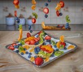
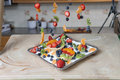
I was asked how I executed my entry. Here is the unedited capture. I used bendable wire hanging from a crossbar I built above the plate which was on an acrylic desk pad and angled upwards to get the visual I wanted. The fruit was pierced with the wire and bent so the fruit was not looking like it was all falling in the same line. The wire was cloned out in the final picture.
 |
|
|
|
01/09/2025 10:44:05 AM · #10 |
| Terrific discussion. I wish we saw a lot more of these :-) We'd all benefit. |
|
|
|
01/09/2025 12:52:00 PM · #11 |
In case anyone missed it, here is another way of doing something similar.
The combination of the two approaches could be to move the crosbar with hanging fruit upwards during exposure, after an initial static time.
I wonder how much you would see remaining from the bendable wire and whether it would still be possible to edit that out (probably a lot more work anyway).
|
|
|
|
01/09/2025 02:23:38 PM · #12 |
| Interesting to try but without flash. Also the fruit would probably have to be moved further apart from each other because the overlap in movement would look messy I imagine. |
|
|
|
01/09/2025 02:25:00 PM · #13 |
Originally posted by GolferDDS:
Interesting to try but without flash. Also the fruit would probably have to be moved further apart from each other because the overlap in movement would look messy I imagine at a slower shutter speed. |
|
|
Home -
Challenges -
Community -
League -
Photos -
Cameras -
Lenses -
Learn -
Help -
Terms of Use -
Privacy -
Top ^
DPChallenge, and website content and design, Copyright © 2001-2025 Challenging Technologies, LLC.
All digital photo copyrights belong to the photographers and may not be used without permission.
Current Server Time: 03/31/2025 11:16:04 PM EDT.