| Author | Thread |
|
|
05/16/2008 11:11:01 PM · #1 |
Ok, I've got two shots of late that I like, but they just don't seem to have "it"! I don't know if it's my post processing lack of skills or the fact that the subject matter is bad or that I just suk, lol, at taking photos.
If anyone is willing...I'd love some pointers on how I've missed on these shots please. I take what I think is kewl, but I don't know how to get them to the next level. (I don't feel like I'm improving.)
Thanks to anyone willing to give it a go! (Choose something else if you wish!)
  |
|
|
|
05/16/2008 11:19:04 PM · #2 |
Neither shot really say anything. There is no context to them. What I am saying is in the first one its a couch in water........is that it? There isnt anything else in the photo to be it in to context for me. Nothing that says this is why I took it, this is what it means. To me this is just a photo of trash someone dumped in the water.
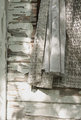
Second photo again, it looks like a snapshot of well....I think its an old house, building, something with some curtains or something hanging out. Its shot too tight and leaves way too many questions to answers the photo cant tell me.
Matt |
|
|
|
05/16/2008 11:23:33 PM · #3 |
I think I agree with Matt to an extent. I little bit wider of a shot would put these into some sort of context. Also, these two shots in particular, don't have much n the way of color to "bring out." The second one I feel could be vastly improved with some levels adjustments, or some dodge and bur to show the shadows and textures. I think you would probably be surprised how much that one could improve.
Message edited by author 2008-05-16 23:23:47. |
|
|
|
05/16/2008 11:27:06 PM · #4 |
|
i hope you don't mind that i edited one of you shots just as an example. i think the MAJOR thing that improves any photo is if you level out the shot, if the lines in the photo are slightly off i think its distracting.[thumb]679284[/thumb] so what i did really was use the straighten tool, crop, did some levels,shadows, darken highlights, midtone contrast and thats really it.. i don't know if you think my edit is good or not, but this is what i thought would improve the shot more... :) |
|
|
|
05/16/2008 11:27:22 PM · #5 |
This is what I'm talking about...the window prolly is cropped too tight, but I never know how much to remove. I don't know how to dodge and burn, so I guess I start there.
(I liked the weeds growing out of the couch...this area flooded and I don't think this was actually dumped, but used to party with at one point, lol!)
Leane...thanks for taking the time...I like this, but I guess I'm always afraid that I've gone too far...when in reality I don't go far enough I guess. (That's why my stuff is boring...)
Message edited by author 2008-05-16 23:29:17. |
|
|
|
05/16/2008 11:35:00 PM · #6 |
Just a bit more umph.
[thumb]679285[/thumb]
Message edited by author 2008-05-16 23:36:22. |
|
|
|
05/16/2008 11:39:26 PM · #7 |
I see that it's already been done, but I did a quick edit as well. Bumper the shadows with levels and a little burn. Pushed up the saturation a little bit on the red channel to bring out some of the wood grain. Unsharp mask. Voila! :-) I'm certainly no photoshop master, and have really only been using it for a couple of months. I'm sure others can do a much better job than I. Just play with things a bit and see what happens!
[thumb]679291[/thumb]
Edited to say: Now that I look at it again, I may have bumped up the red a bit much! You get the idea. lol
Message edited by author 2008-05-16 23:41:36. |
|
Home -
Challenges -
Community -
League -
Photos -
Cameras -
Lenses -
Learn -
Help -
Terms of Use -
Privacy -
Top ^
DPChallenge, and website content and design, Copyright © 2001-2026 Challenging Technologies, LLC.
All digital photo copyrights belong to the photographers and may not be used without permission.
Current Server Time: 07/15/2026 05:25:03 PM EDT.


