Henry,
Of the two shots Carla_1 (even rotated) is the weaker. The reason IMO is the angle of approach to the model, the pose, the cropping and the background. On the angle of approach, based on the model's movements, you're shooting up into her face, which causes her chin knows to be prominent and flattens her face. It also creates deep shadows on the neck.
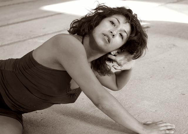
One of this modelΟΔÄôs strong attributes IMO is her well-proportioned facial features which are suited by being framed by her hair. In this pose her hair is pulled back from one side and flat on the other (over her right ear). Never mind that this can look odd on any subject (one side behind the ear and the other side in front of the ear), on this model it detracts IMO from giving her lovely face a frame in which to set its classical beauty. Coupled with the angle of approach (which is something you can control) is the subjectΟΔÄôs pose (which is generally something she controls unless you pose her). In this composition she is turned at the waist. This can be a wonderful move and IΟΔÄôm sure you can capture it well so I have no problem with that. The problem for me comes in how we donΟΔÄôt see the full turn (see cropping later). It also comes in how her she places her left hand behind her ear (which also has an earring in it that doesnΟΔÄôt add to the composition and isnΟΔÄôt offset; itΟΔÄôs a single element that isnΟΔÄôt strong enough to add much but is strong enough to detract given its placement. Because the arm forms a left darker area, it continues the coloration that moved up the subjectΟΔÄôs body from the lower left of the frame. ThatΟΔÄôs a good thing. It sets a nice backdrop against which her lightened face becomes the point of interest. The problem here is that the subjectΟΔÄôs left hand is turned so that it catches light and competes with the face. This is exacerbated by the loss of her fingers. If the hand didnΟΔÄôt compete with the face (by being lighter than the hair and skintones around it) or if all the fingers were visible (generally not as appealing) then the viewer wouldnΟΔÄôt be drawn to this area as much and could linger on the face. Now the earring I mentioned before comes into play. Since the viewerΟΔÄôs gaze seems to travel down the lighter face towards the hand, the viewerΟΔÄôs mind notices that the fingers are abbreviated and that the ear makes some odd connection (in skintone) with the index finger. This becomes slightly more confusing and the earring being a hard outlined, shiny object just adds to the disorientation. IMO this area (due to lighting and the outline of the subjectΟΔÄôs hairline) becomes slightly more impacting that just a ΟΔÄ€nitΟΔÄù because it diffuses the interest of the viewer by being so close to the modelΟΔÄôs face and being slightly disorienting visually. Perhaps if her head was resting lightly on the palm of her hand and her hair hung free down past her ear on her left side then the lack of symmetry would be offset by the strong visual element that her dark hair lends to her face would create a photo that displayed her beauty better.
The cropping in this shot also doesnΟΔÄôt help the strength of the image. . While you got the modelΟΔÄôs head in the frame and showed terrific ability to capture different tones throughout the composition and the modelΟΔÄôs body (great job on that, btw), youΟΔÄôve cropped the modelΟΔÄôs hand in a distracting manner. The inclusion of just a little thigh where the leg actually becomes difficult to distinguish is distracting, too. I donΟΔÄôt know that you can recrop this image to produce a stronger shot as far as the bottom of the photo goes, perhaps this is just a crop from a larger composition. If so, then IΟΔÄôd suggest trying a couple of different crops but donΟΔÄôt but into the hand and donΟΔÄôt crop at the wrist if you can help it.
Finally I find the background to be a weaker element of this composition in some sections of the photo. The floor just under the model is well-captured and displays those levels of tones that I mentioned you getting earlier. This is a pleasant view of this background and it doesnΟΔÄôt detract from your composition at all. The top section of the photo, however, becomes contentious with your subject due to the hard, straight lines in the top left of the photo and the bright light directly behind the subjectΟΔÄôs head and extending to the right corner. IΟΔÄôm not sure what you could do here as these elements (the strong lines and bright spot) could be important elements to a photo; they could lend some emphasis to a photo so IΟΔÄôm not saying that theyΟΔÄôre bad to use in general. In this photo, though, you have a subject in a more classical beauty pose where her face appears to be the strongest element (or the one you wanted to present the most) and her body is well-captured and presented through the use of multi-toned treatment where you maintained the definition of her skin and clothing throughout the tones. A subdued background looks like it would lend itself to the look of the model and the way you edited it.
Kev |