| Author | Thread |
Comments Made During the Challenge  |
|
|
09/07/2004 05:28:34 PM |
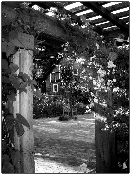
| Really nicely done. Black and white works well with this shot. I also really like that it is crystal clear through the whole depth of field. |
|
|
|
09/05/2004 12:53:36 PM |
| Lovely tones. A bit oversharpened, and perhaps a bit busy,too. I like the mottled light a lot. |
|
 Photographer found comment helpful. Photographer found comment helpful. |
|
|
09/05/2004 04:15:39 AM |
| the area with the white flowers and the house is a bit messy: it's hard to tell which is which: would a colour picture have made this clearer? Otherwise a nice picture |
|
| Photographer found comment helpful. |
|
|
09/04/2004 06:36:21 PM |
| The black and white adds to the feeling of nostagia. Nicely done. |
|
| Photographer found comment helpful. |
|
|
09/03/2004 02:01:41 PM |
| Nice photo but could you have bent down and captured more of the lovely house than the empty patio? |
|
| Photographer found comment helpful. |
|
|
09/02/2004 11:29:29 PM |
| I'd love to see what the color version looks like. I feel like the type of subject (flora) and the complex detail of the picture would lend itself to be better represented in color. In B&W, the stuff on the upper right coner of the door frame has too much going on for my eyes and it just becomes a big complicated blob of distraction without colors to help the brain figure out what's what. |
|
| Photographer found comment helpful. |
|
|
09/02/2004 10:22:04 AM |
| too sharp and contrasty, hard to know what youre looking at |
|
|
|
09/01/2004 11:59:01 PM |
|
| Photographer found comment helpful. |
|
|
09/01/2004 05:58:12 PM |
| Would this have looked better in color? I do like it though. |
|
| Photographer found comment helpful. |
|
|
09/01/2004 10:43:31 AM |
| this photo is too loaded with stuff... the frame should not contrain the user to see the framed object which I suppose it was the house that we barerly see. Nice lighting, anyway. |
|
| Photographer found comment helpful. |
|
|
09/01/2004 03:49:19 AM |
| This is a very busy image for B/W imho. My eyeball is going all over the place. It took me a while to see the chair. I would love to see a color version. The lighting looks great. |
|
| Photographer found comment helpful. |
|
|
09/01/2004 01:30:28 AM |
| Lovely, would love to see this in color. |
|
| Photographer found comment helpful. |
|
|
09/01/2004 12:47:49 AM |
| nice picture, the framing is a bit distracting but the concept is good |
|
| Photographer found comment helpful. |
Home -
Challenges -
Community -
League -
Photos -
Cameras -
Lenses -
Learn -
Help -
Terms of Use -
Privacy -
Top ^
DPChallenge, and website content and design, Copyright © 2001-2025 Challenging Technologies, LLC.
All digital photo copyrights belong to the photographers and may not be used without permission.
Current Server Time: 03/12/2025 08:14:18 AM EDT.