| Author | Thread |
Comments Made During the Challenge  |
|
|
09/07/2004 07:09:42 PM |
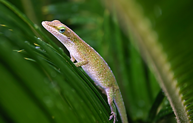
| a little too much unsharp mask, but a nice image. lizards skin has a nice texture ^_^ |
|
|
|
09/05/2004 05:12:56 PM |
| I love the 'framing' in this image. I am but a bit uneasy about not seeing the whole body. Well, of course, you don't need to show the whole body. But the crop or composition isn't right for me. If it was somewhere in the frame where it had some space to move around, I think it would look better. Again, for framing, I really like how you have approached it. |
|
|
|
09/04/2004 06:49:50 PM |
| Great shot, but it would fit the challenge a bit better if you had arranged the focus so that we could see what was in front of the lizzard, and what was behind it. |
|
|
|
09/04/2004 08:52:25 AM |
|
|
|
09/02/2004 11:54:25 PM |
| I don't see the challenge here at all. sorry. |
|
|
|
09/01/2004 08:36:51 PM |
| Grand title. Nice shot. Framing is a bit blury. |
|
|
|
09/01/2004 03:31:05 PM |
| don't see where it fits category |
|
|
|
09/01/2004 09:07:49 AM |
| The blue/magenta color casting in the subject suposes a huge post processing. I prefer the correct exposed frame. |
|
Home -
Challenges -
Community -
League -
Photos -
Cameras -
Lenses -
Learn -
Help -
Terms of Use -
Privacy -
Top ^
DPChallenge, and website content and design, Copyright © 2001-2025 Challenging Technologies, LLC.
All digital photo copyrights belong to the photographers and may not be used without permission.
Current Server Time: 03/12/2025 03:04:38 PM EDT.