| Author | Thread |
|
|
09/14/2004 10:16:38 PM |
Greetings from the Critique Club :)
Hi Shadowfax...
Sidenote: I'm listening to "Folksongs for a Nuclear Village" as I write this critique :)
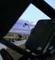
This is a nice photo and I like most of what I see. The horizon tilt is not a good thing in this photo though. Also, as far as challenges are concerned, your score probalby suffered because your 'framing' element is not the primary impact of this photograph. It's a smaller secondary 'supportive' element. This particular image may have also made a stronger vertical shot as well....
John Setzler
|
|
 Photographer found comment helpful. Photographer found comment helpful. |
Comments Made During the Challenge  |
|
|
09/07/2004 11:34:17 PM |
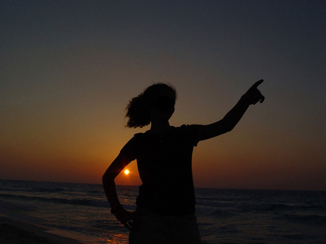
| Nice idea; Could use some noise reduction though, and most of all, a level horizon! |
|
| Photographer found comment helpful. |
|
|
09/07/2004 04:06:12 PM |
| This pose looks a little too awkward... |
|
| Photographer found comment helpful. |
|
|
09/07/2004 12:05:00 AM |
| Nice silhouette. Crooked horizon, no framing. |
|
| Photographer found comment helpful. |
|
|
09/02/2004 11:30:00 AM |
| Neat pose - I'd be tempted to crop a bit tighter and level out the horizon. |
|
| Photographer found comment helpful. |
|
|
09/01/2004 04:15:39 PM |
| Oh yes I see, the arm and body frame the sun. |
|
| Photographer found comment helpful. |
|
|
09/01/2004 02:58:52 PM |
|
| Photographer found comment helpful. |
|
|
09/01/2004 11:18:04 AM |
| cleaver shot. A bit grainy, but not too bad |
|
| Photographer found comment helpful. |
|
|
09/01/2004 06:16:53 AM |
| Nice photo, although framing only makes up a small amount of photo. Well done. |
|
| Photographer found comment helpful. |
|
|
09/01/2004 05:40:33 AM |
| You missed the frame. A shot itself is ok, but nothing special. And it's tilted. should have rotated it around 3deg left. |
|
| Photographer found comment helpful. |
|
|
09/01/2004 04:16:00 AM |
| Try framing a subject next time |
|
| Photographer found comment helpful. |
|
|
09/01/2004 03:41:17 AM |
| Nice idea. This is a tough shot because the sky is so cloudless. Almost surreal. I kinda wish the subject wasn't dead center. It would have been nice if she and the sun were placed slightly more to the left of the frame. |
|
| Photographer found comment helpful. |
|
|
09/01/2004 02:58:25 AM |
| I am not trying to be negative here, possibly because I don't see it, but what does this have to do with the subject? |
|
| Photographer found comment helpful. |
|
|
09/01/2004 12:15:35 AM |
| Too dark ... and its squish .. the framing isn't the best, its a great idea but needs technical improvment. I hope that helps a bit .. |
|
| Photographer found comment helpful. |
Home -
Challenges -
Community -
League -
Photos -
Cameras -
Lenses -
Learn -
Help -
Terms of Use -
Privacy -
Top ^
DPChallenge, and website content and design, Copyright © 2001-2025 Challenging Technologies, LLC.
All digital photo copyrights belong to the photographers and may not be used without permission.
Current Server Time: 03/12/2025 06:24:33 PM EDT.